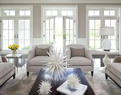
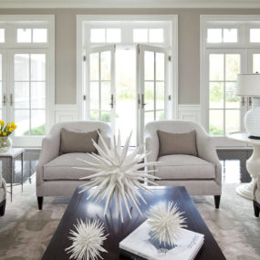
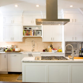
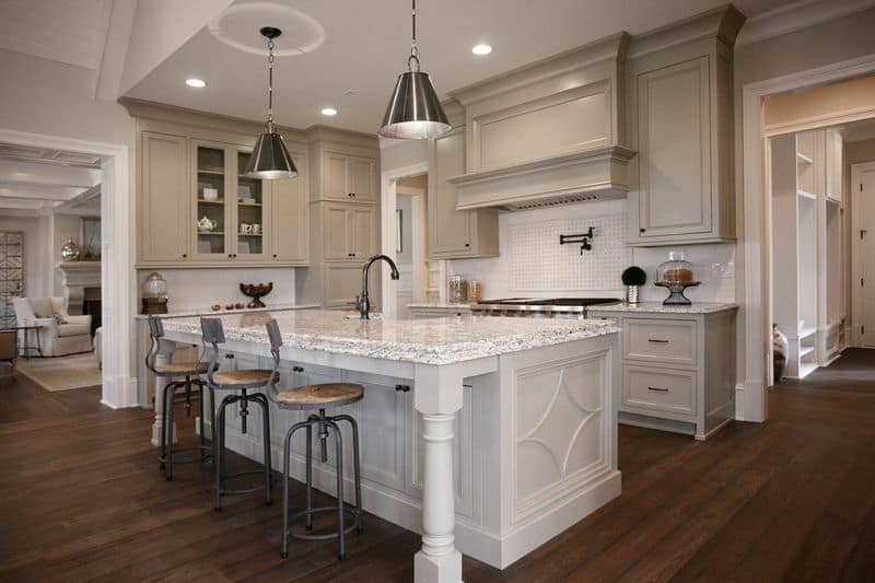
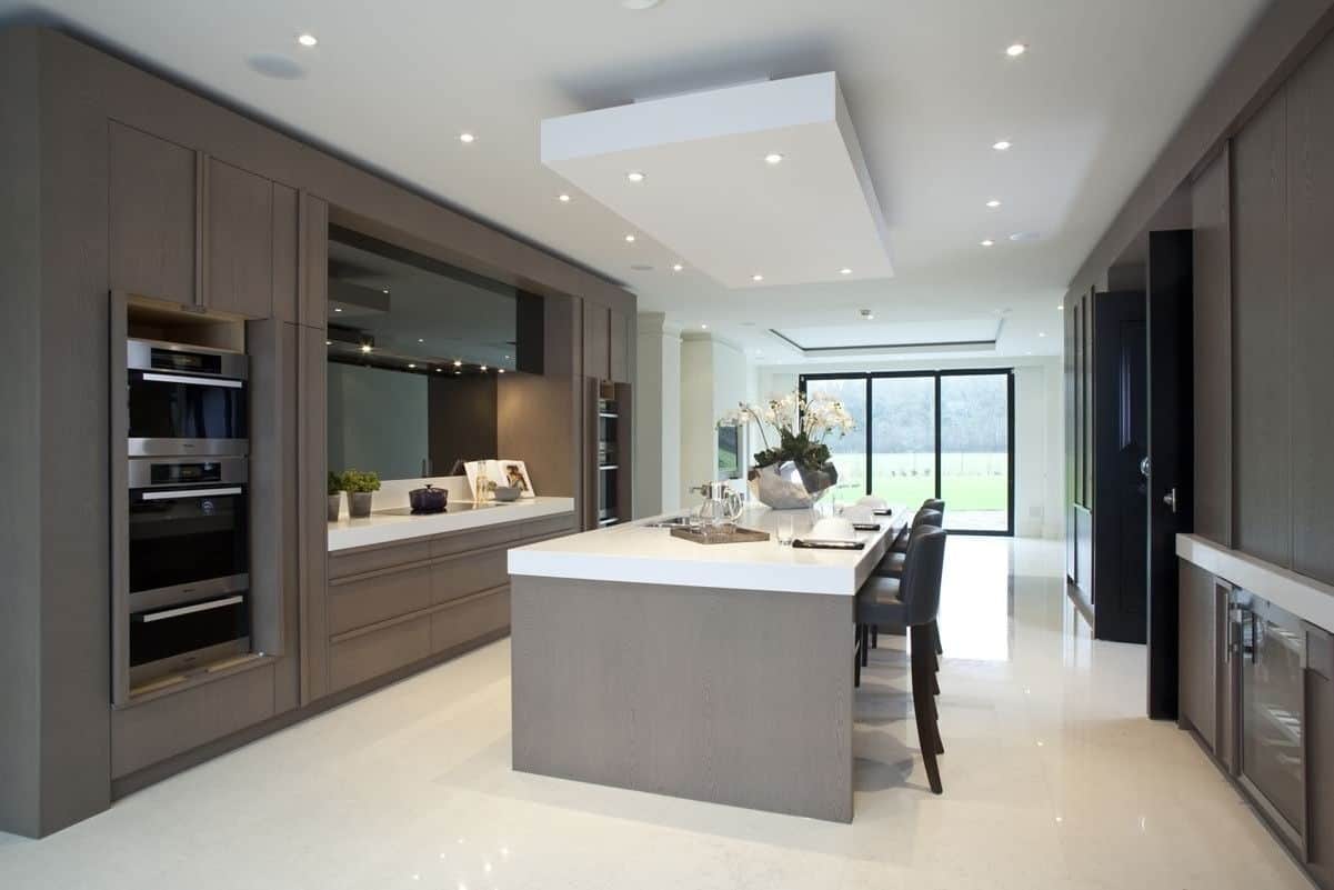
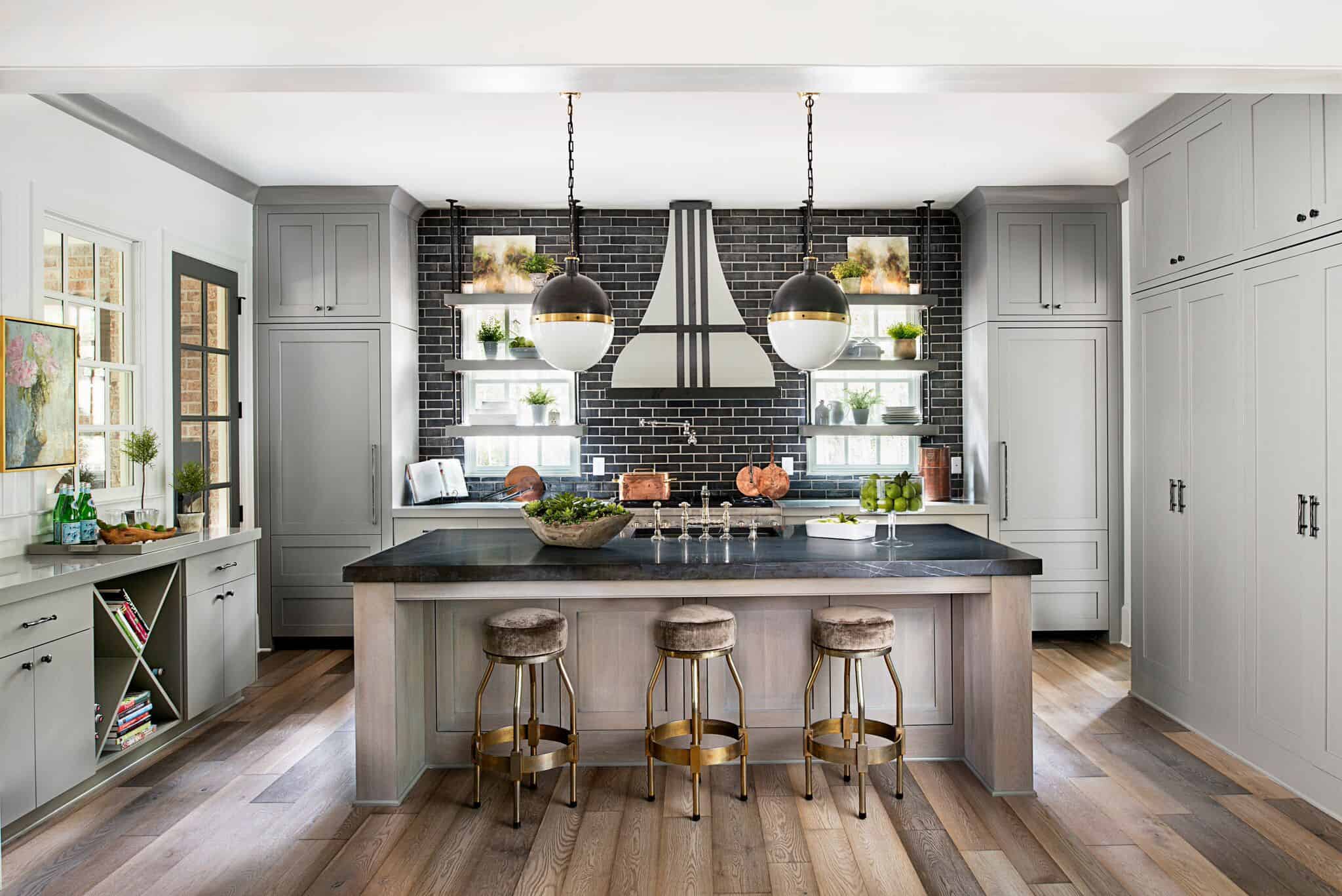
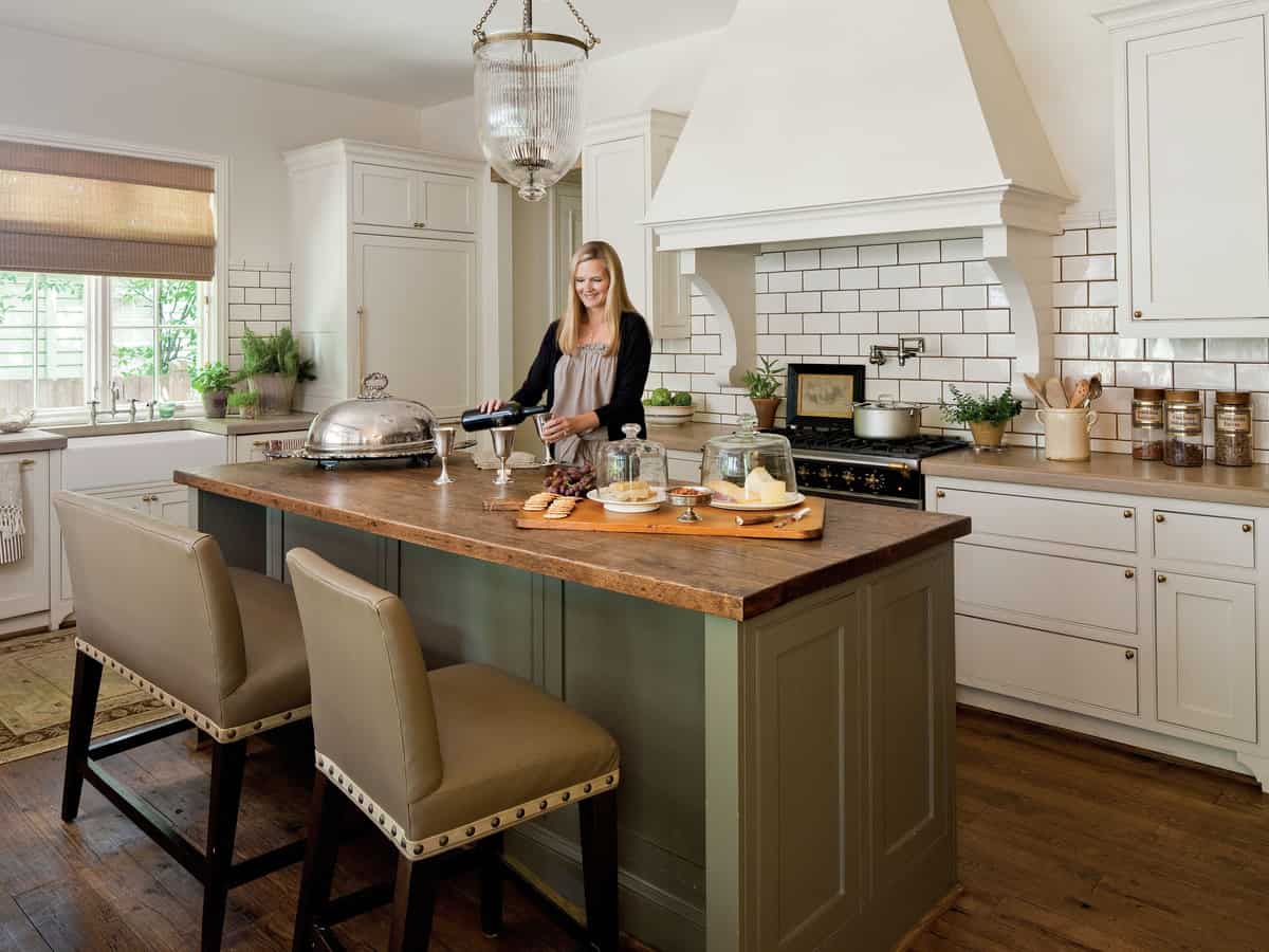
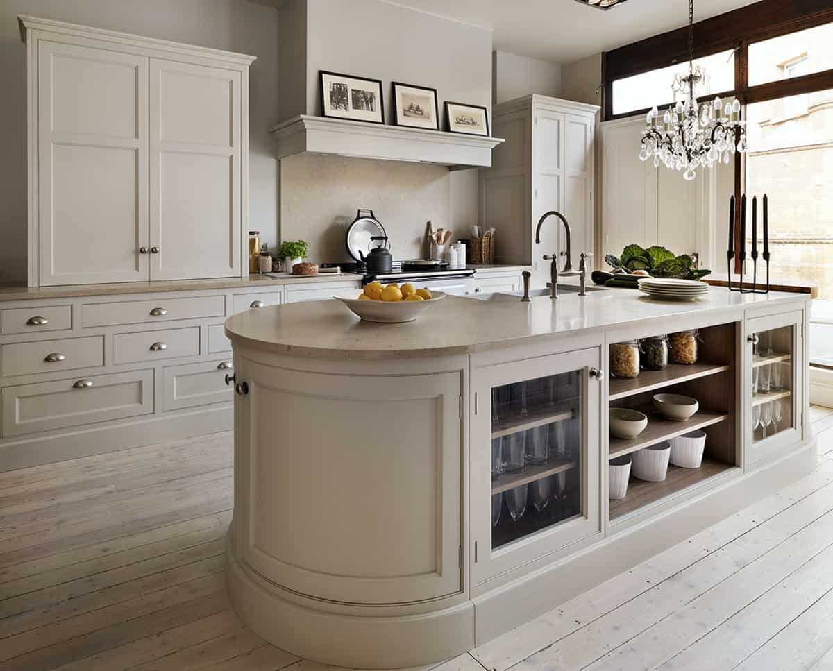
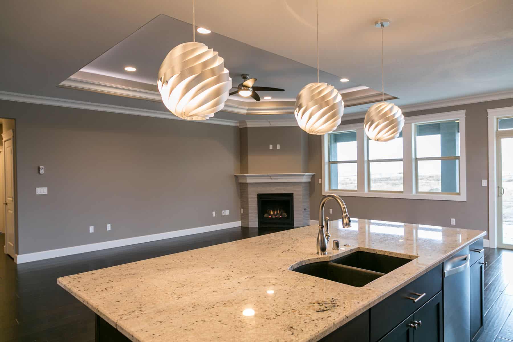
The color you select for your cabinetry sets the tone for the décor you will be using in your kitchen space. We’ve written articles on tips and color options that will best suit your kitchen space. Whether you are a fan of an all-white kitchen or you enjoy darker cabinets, chances are we have something for you. However, this time we are talking about an all-time favorite: the color taupe. Just like the color white, the color taupe brings an elegant appeal to the kitchen in a simple manner that is not overpowering. Here are our top, taupe paints for your kitchen cabinets.
Indian River 985 – Benjamin Moore
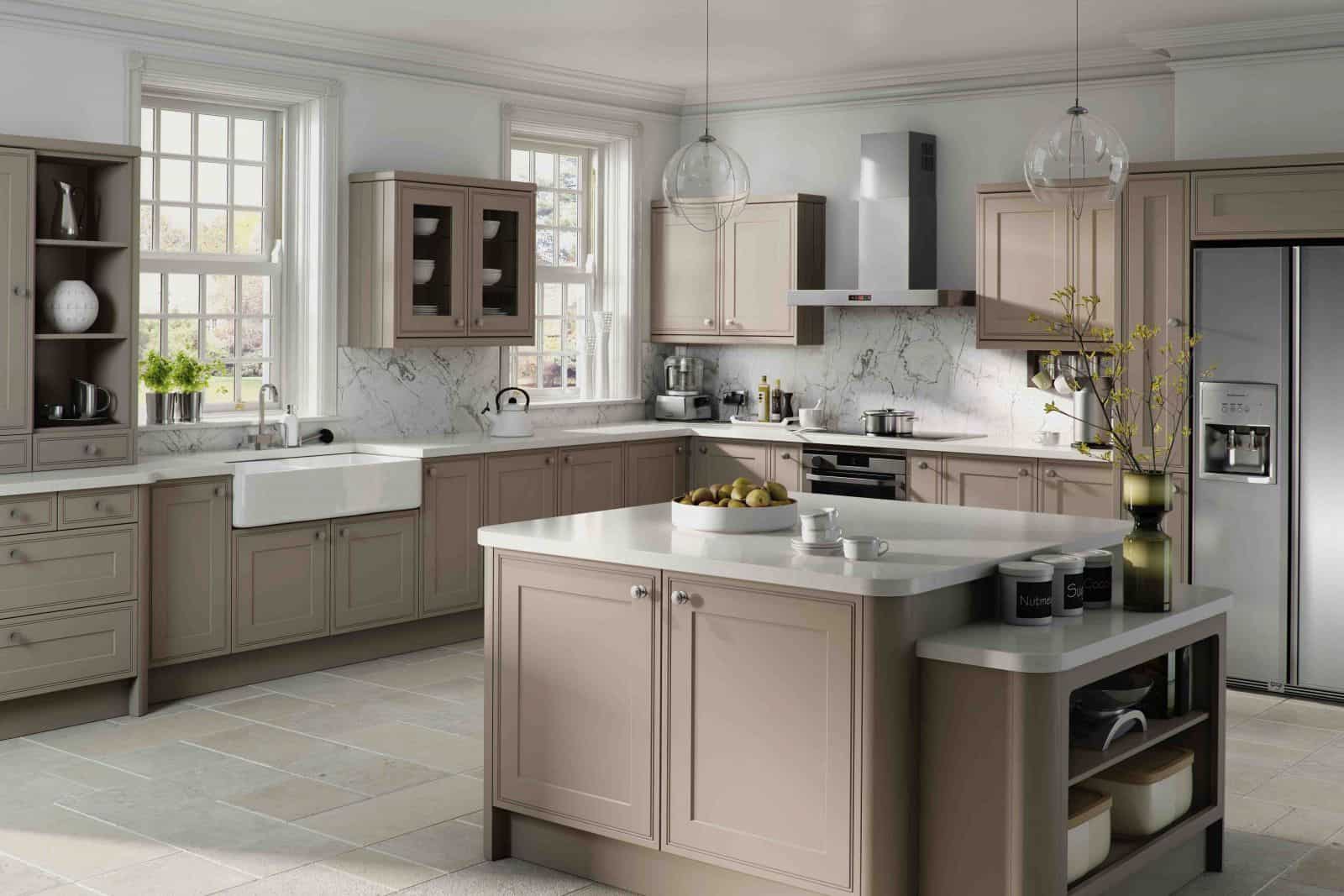
This beautiful shade of taupe works perfectly for a kitchen that centers around the color. The color is best used on the cabinetry and the island. You want to create a cohesive look that this seamless. Doing so will expand the size of the kitchen and give it an elegant, charm. Because the color is so cool and soft it does not overwhelm the kitchen. In fact, if you would like to add a bold touch this color would be perfect as a contrasting hue.
Smokey Taupe 983 – Benjamin Moore
This shade of taupe offers a warmer feel than the Indian River would. The reason behind this is that it has a hint of red undertone. Red undertones add a richer feel to the shade while still being in the soft range of taupe. The beauty of this is that the shade blends in with other taupe hues perfectly. Therefore, you can pair a few shades of taupe together with a slight difference in them. This shade is best used on kitchen islands or on a wet bar.
York Gray – CW45 – Benjamin Moore
When you first read the name of this paint shade you may think “but it says gray”. This shade has a hint of gray and yellow undertones just a slight hint, but it is enough to create a softer shade of taupe. The hue is charming while still having that taupe feel that blends in perfectly in the kitchen. It is also a color that commands your attention. Therefore, using it on your cabinets will work best for this shade.
Temperate Taupe – Sherwin Williams SW6037
This richer, bolder shade of taupe is perfect when you want to add a bolder hue to your kitchen while still remaining in the taupe family. This particular shade of taupe has a grayish/brown undertone that stands out from most. Therefore, we recommend using it as a statement color or as a daring pop of color in the kitchen.
Truly Taupe – Sherwin Williams SW6038
Just like the name says, “truly taupe” is the perfect definition of a taupe. This particular hue has an undertone of lavender. This shade is perfect all over the home. In fact, we would recommend working with it not only as part of your cabinetry but also as part of your main décor shade throughout your home. The shade will brighten up the kitchen with a hint of subtle color.
Joa’s White 226 – Farrow & Ball
If you want a contemporary yet fun hue of taupe look no further. This shade is perfectly modern in an amazing way. The color plays well with any other hues and it adds that modern feel into the space with little to no effort. To can have the ultimate traditional kitchen and then add this hue of taupe and the entire space will just take a modern feel to it.
Dimity 2008 – Farrow & Ball
The true definition of the light hue of taupe you can come across. This shade of taupe is almost white. Its red undertone adds a warmth to it that is so subtle it makes it charming. The charming aspect of it is that the shade feels and looks like cotton. It’s the perfect subtle, rich shade that just feels like home.
Oxford Stone 264 – Farrow & Ball
A darker hue of taupe is also nice when you are selecting shades of taupe for your kitchen. The idea is to create a contrasting hue throughout your kitchen that will brighten up the space. Brighten up the area while having different shades of taupe will work well in a smaller kitchen as it will make the kitchen appear larger than what it is. This is another red based taupe shade that is warm throughout.
Poised Taupe 6039 – Sherwin Williams
Poised taupe is the perfect vintage shade. At first, you may take a glance at it and think “this shade is a bit too dark”. However, that is the beauty of this hue. It works like a chameleon the color will change depending on what you pair it with. If you pair it with darker hues the color will take a bolder feel. However, if you use lighter décor pieces it will appear lighter. It’s the perfect color to work around.
French Taupe 120E-2 – Behr
The perfect shade of taupe is here. We saved the best for last this shade of taupe is great regardless of the theme you may have going on in the kitchen. The color just flows perfectly throughout the space. This shade will brighten your kitchen, even if you use it as a highlight color, this hue will do the trick.
Taupe is an extremely underrated color. Which of these shades do you want to incorporate into your kitchen? Please let us know in the comments below.