Every fashion and home décor lover knows trends tend to always come back full circle, which is perfect when you want to add a retro feel or hue to your home. Luckily, if you have been intrigued by retro hues they are coming back on trend in a huge way! Here are those retro hues that are no longer retro instead they are now trendy and perfect to add to your home.
Autumn Gold
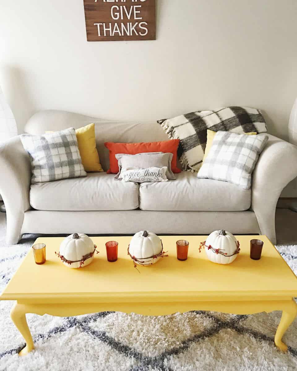
A hue that has been seen throughout the centuries is finally coming back with a furry- autumn gold. The shade itself screams vintage vibes while still having a bit of a fall feel. The beauty of this is its classic aesthetics works well with numerous different shades and textures.
Kelly Green
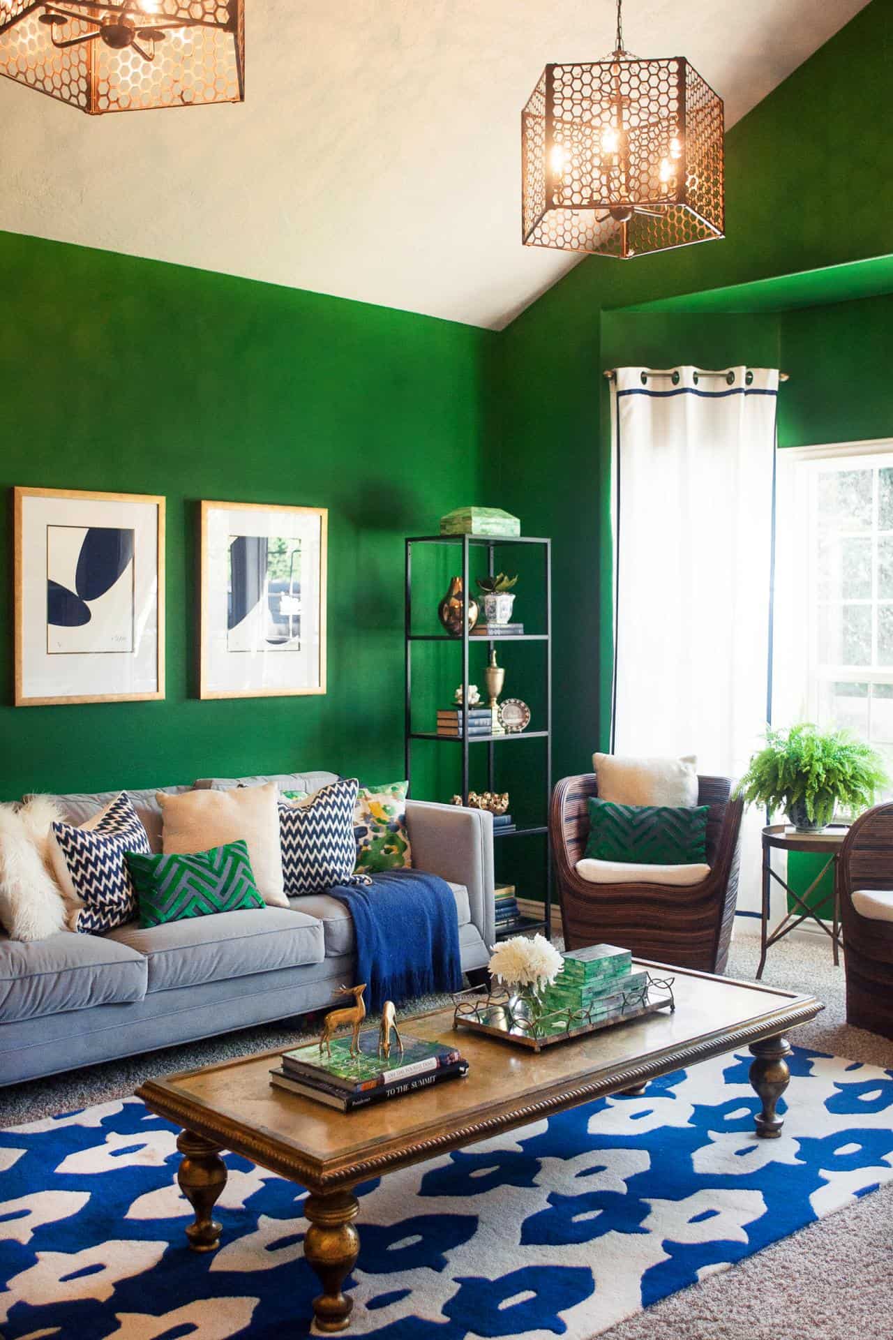
This classic, charming green is another beautiful shade that is coming back extremely strong this year. Greens in general, are making a comeback because of their natural feel, interior decorating is becoming more about showcasing the homeowner’s personality while still having a natural feel and being less dramatic. Kelly green is the perfect shade to pair with hues of pink, they create a classic, trendy combination.
Dusty Rose
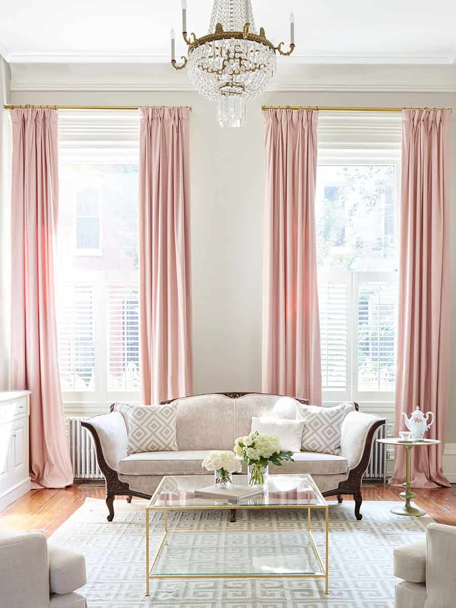
We mentioned dusty rose in our “best color combinations for 2018” due to it being a beautiful color combination. Do not mistaken this muted hue for “millennial pink” a shade that is brighter and feels more modern. Dusty rose simply feels old worldly and trendy yet oh so vintage.
Rich Burgundy
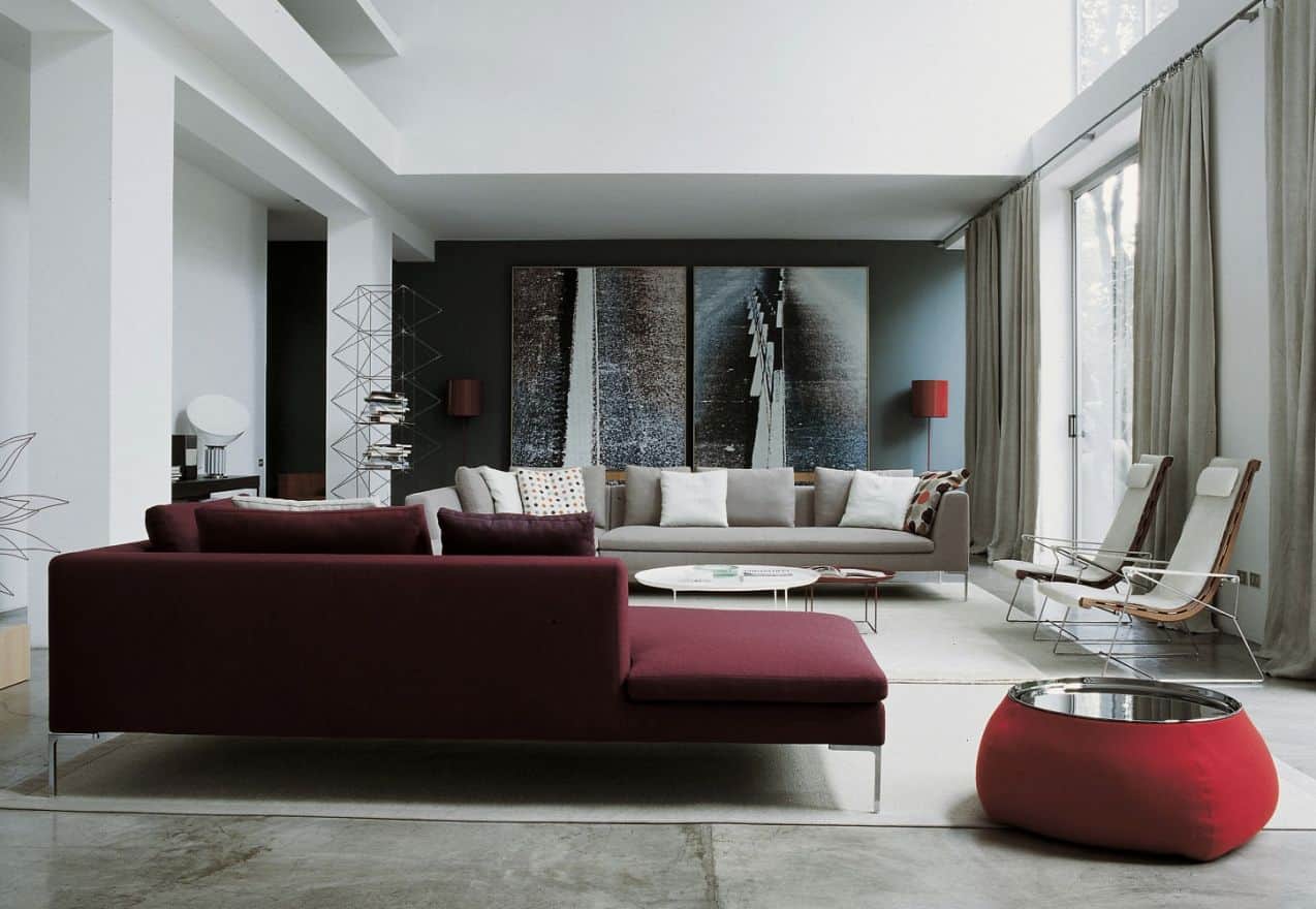
Burgundy itself has always had a sophisticated undertone, however, a richer, darker tone adds a mysterious vibe. Pair with metallics for an elegant, fun twist on this classic hue. You may also want to add nudes that bounce off of the beauty of this color.
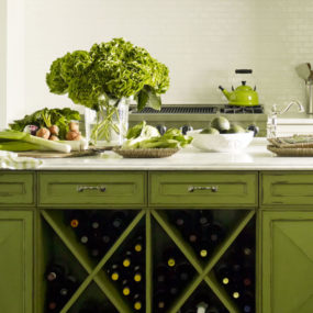
Olive
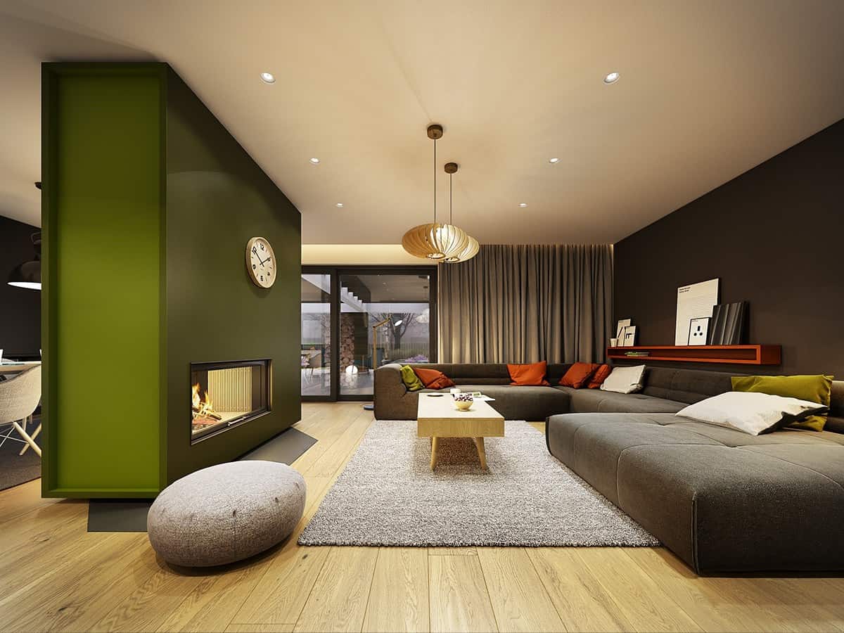
Think of this color as the new neutral- it has depth, visual appeal and it comes beautifully together when it is paired with bolder hues. This is a color that demands your attention while still having that timeless, retro appeal.
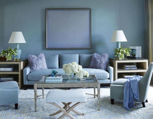
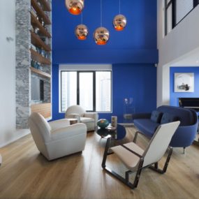
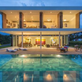
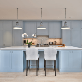
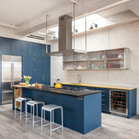
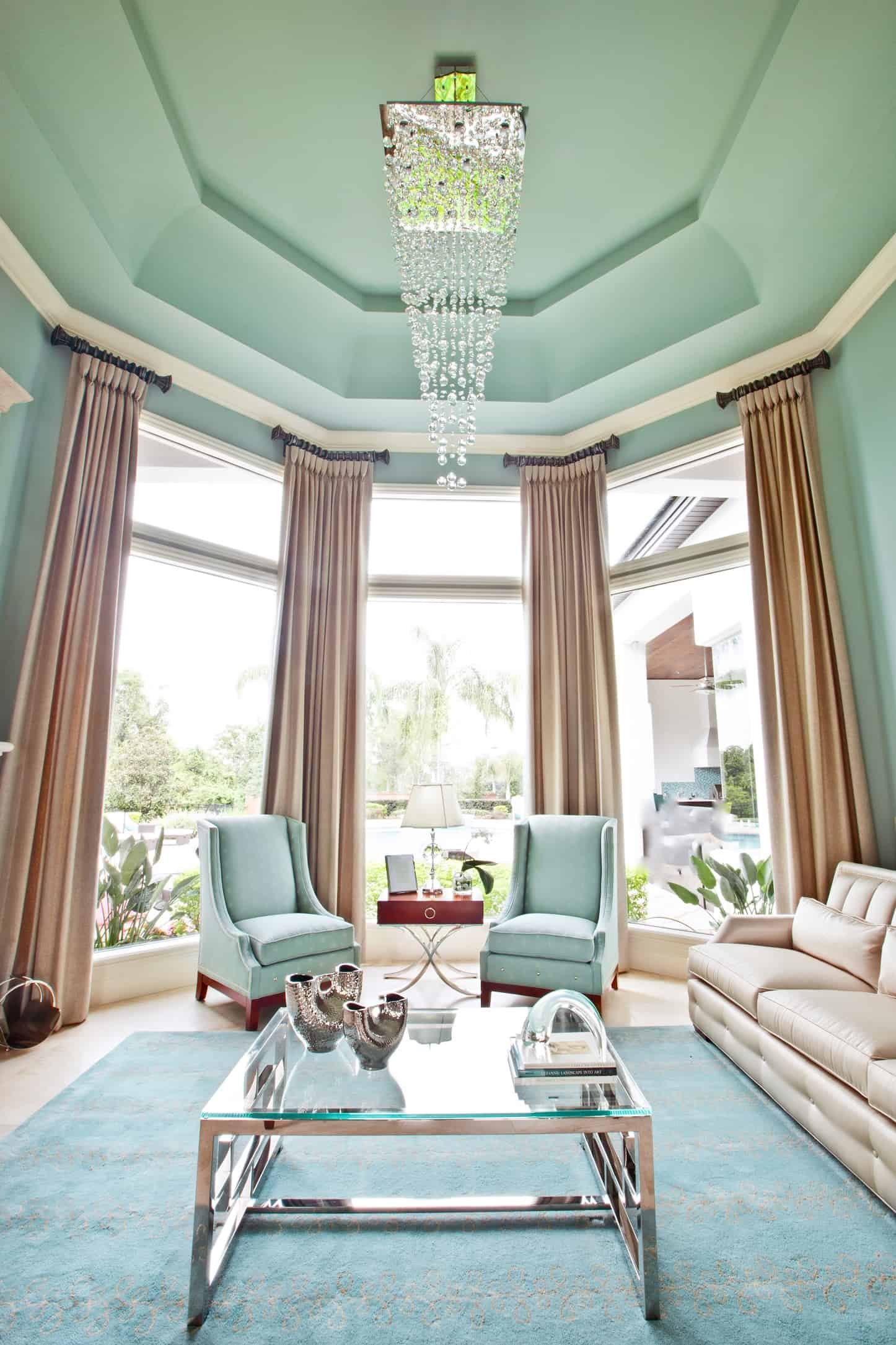
Classic Blues
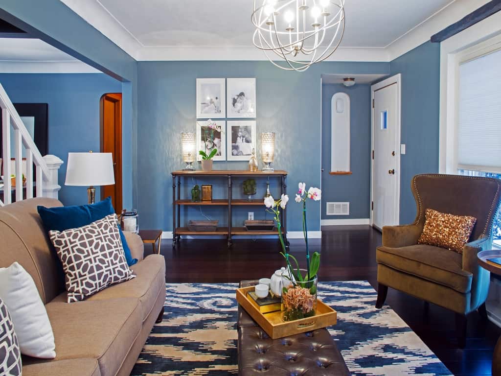
Timeless, classic hues of blue are coming back on trend due to more homeowners wanting to have a coastal, backdrop that screams ageless décor. That is what classic blues such as navy paired with white bits that have some sort of texture and pattern do for your home.
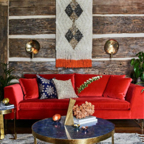
Red
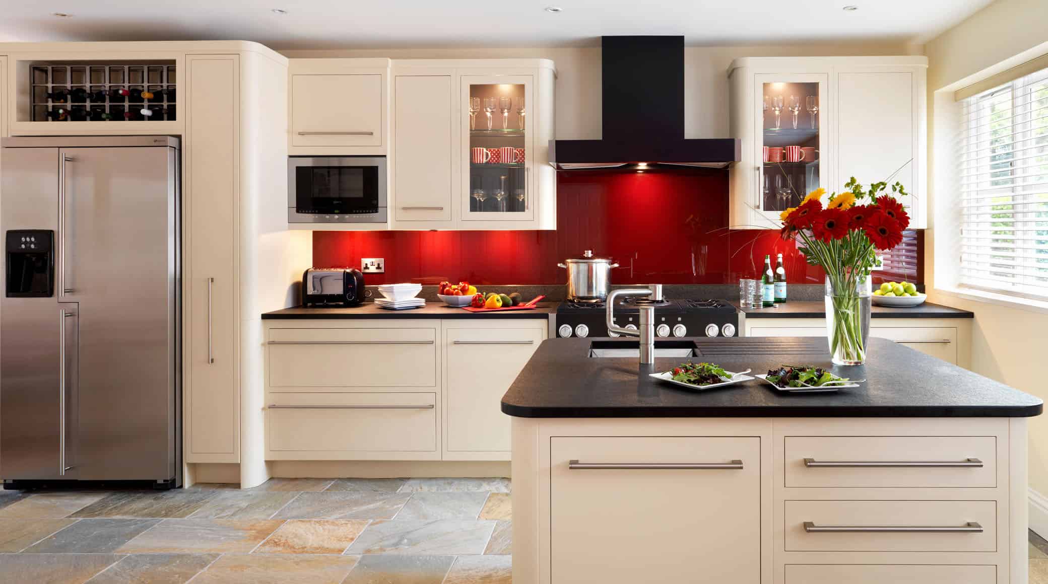
Red has had a bad connotation for quite some time due to being known as a “stressful” color. However, it is one of those retro shades that is coming back to become a staple in the home. We love this retro shade in the kitchen and office space for a twist of rich color.
Unforgettable Teal
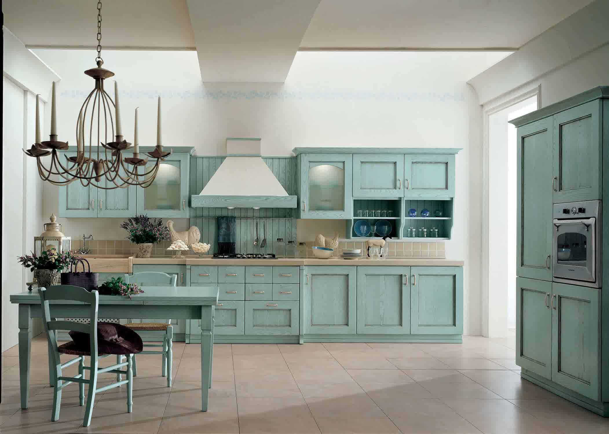
Teal is another color we mentioned in our “best color combinations for 2018” due to its vintage 1950s appeal. We love this color in the kitchen because of its old-worldly aesthetics along with the idea of the color being a muted combination between green and blue.
Magenta
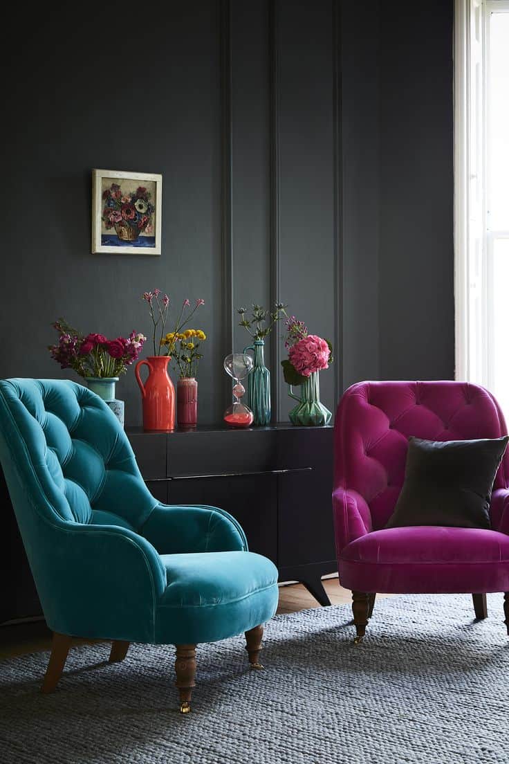
This hue not only reminds us of the 1960s because of its boldness, but it is now becoming the perfect accent hue that brings everything together. For a softer take on this trend consider using it with neutrals the contrast will soften the boldness of it.
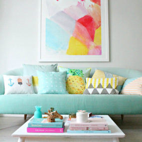
Mint
The informal color just got a bit more formal and modern. Pair it with rich darker wooden pieces for that modern aesthetic. Consider having it be an essential addition to the room while still being a softer focus. Doing so will bring the feel of the color while not being overpowering.
Retro hues are making an undeniable comeback, which of these hues do you want to use in your home? Share with us your decorating ideas in the comments below.