

It may seem like you have to call in all the college trained interior design professionals when you’re ready to redecorate your space, but that isn’t the case at all! In fact, anyone can put a killer space together with a little how to knowledge, so read on to gain your own inside interior design knowledge (and for a few tips!).
1. Understanding the Color Wheel – Primary.
Isn’t this an eye-popping room? Do you wish you could concoct something like this for inside your bedroom? Well the recipe is easy, and all it takes is an understanding of the color wheel. Everyone does (or at least should) know the three Primary colors – red, blue, and yellow – right? These are called primary colors because all other colors are composed of combining those three. So try mixing these colors when you’re decorating if you’re seeking a wild vibe. They’ll play off of one another instead of blending as one. (Although fair warning, yellow and red are said to induce hunger. Hm, McDonalds…)
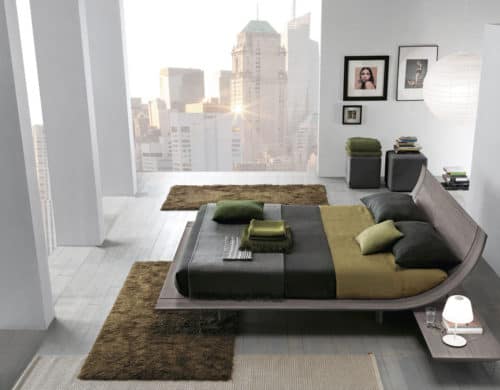
2. Opposites Attract.
Ever hear that statement? Well, if you’re looking for this kind of feeling in your room, that couldn’t be more true. The next step to understanding the color wheel is to talk Secondary colors. These are the colors you get when you mix two equal parts of Primary colors together. Now – when decorating and you want a vibe that really stands out – opposites attract. Each Primary color is opposite a Secondary color on the color wheel (for example yellow and purple) so try combining two of these when decorating a room!
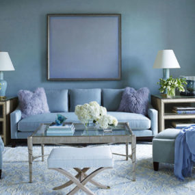
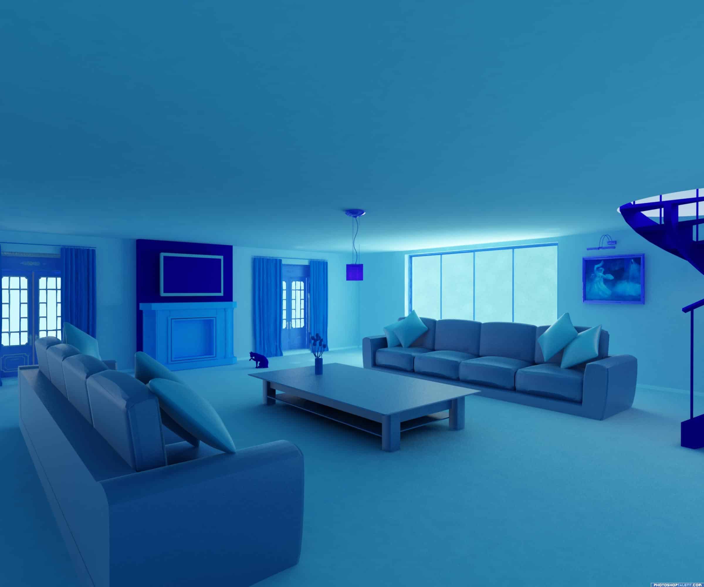
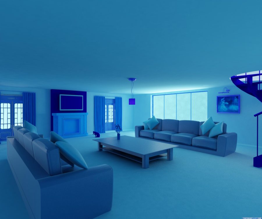
3. Monochromatic Schemes
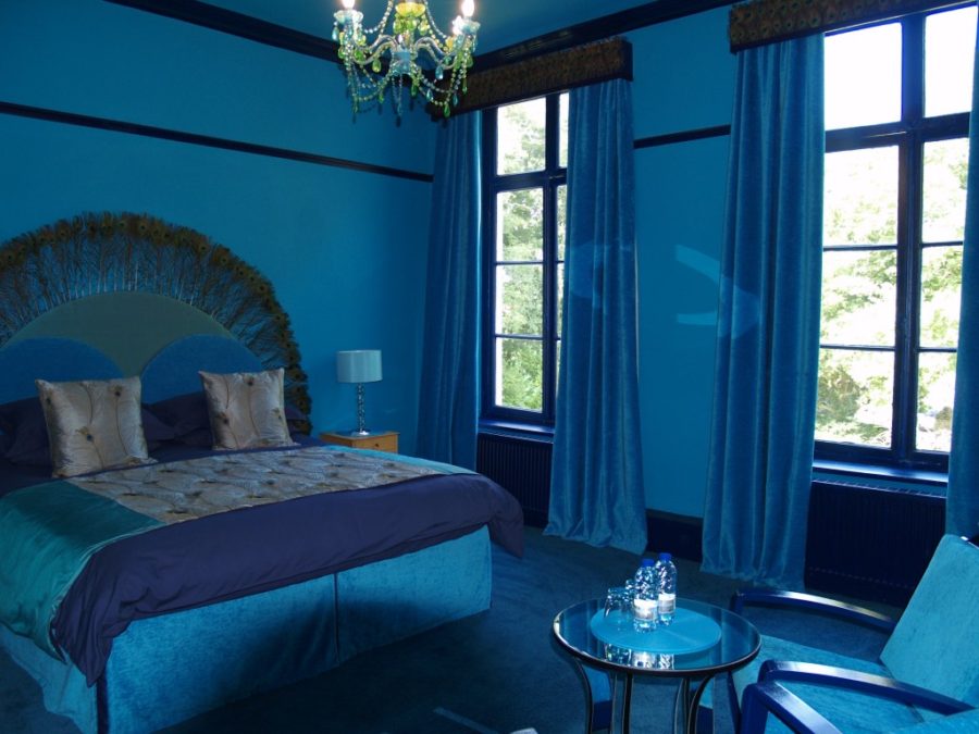
Interested in a blue room? Or red, or yellow, or green, or purple? This kind of design is called monochromatic, and it simply comes from taking a whole bunch of shades (or even just one) and combining all sorts of pieces of furniture that are that color into a room, like the one above. Hint, hint – this is one of the easiest decorating tips – because frankly, it’s nearly impossible to mess it up if everything is the same color anyways.
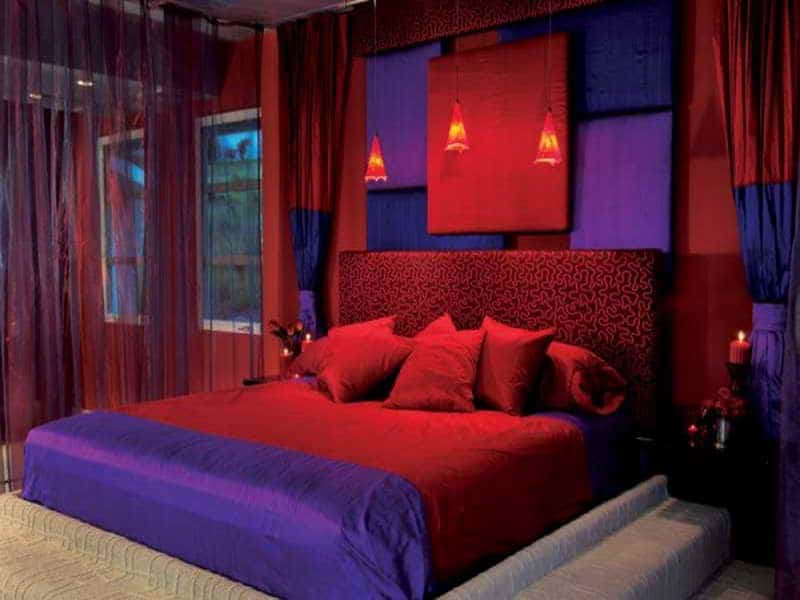
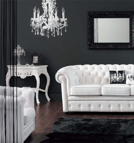
4. Monochromatic Shades
This is another blue room (I know) but if you’re interesting in a design more along this line (which still actually counts as monochromatic) instead of using only shade of a color (for example dark blue like in the picture above) you combine different shades of that color. Light blue, dark blue, medium blue, even black and white (which we’re going to discuss in a moment).
5.Black and White
Despite the long fought out battle (and some will still disagree with this) black and white are not colors. They are a shade and a tint. Allow me to explain. There’s something called a color scale, which is essentially a rectangle broken down into an odd number of boxes (we’ll say seven for the purpose of this explanation). Now, you choose a color – yellow. Just yellow. That goes in the middle box. Now, you work your way to the left, adding a little white to the color each time until it’s entirely white in the ending box That’s called tinting the color. Then you work to the right, adding a little black until it is completely black in the other ending box. That’s called shading. Pretty simple, right? That right there makes black and white two of the best contrasting colors if you want your room to really pop.
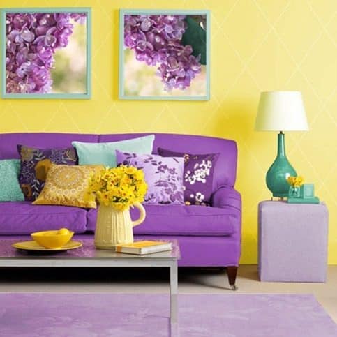
6. Accenting With Black and White
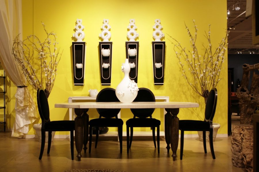
Likewise when it comes to popping colors – black and white are perfect when combined with almost any color. They can give it a more up scale and sophisticated look than just a monochromatic scheme. You can choose to use equals parts of the colors in your room like in the picture above, or twist it up and use only bits of the colors. For example, in the room above adove, you could add a yellow (or any color) pillow to the couch to really make it stand out. In a yellow room, opt for black and white furniture or pictures.
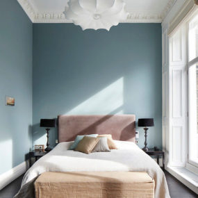
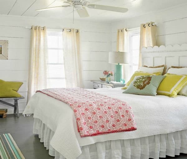
7. Cool and Calm Values
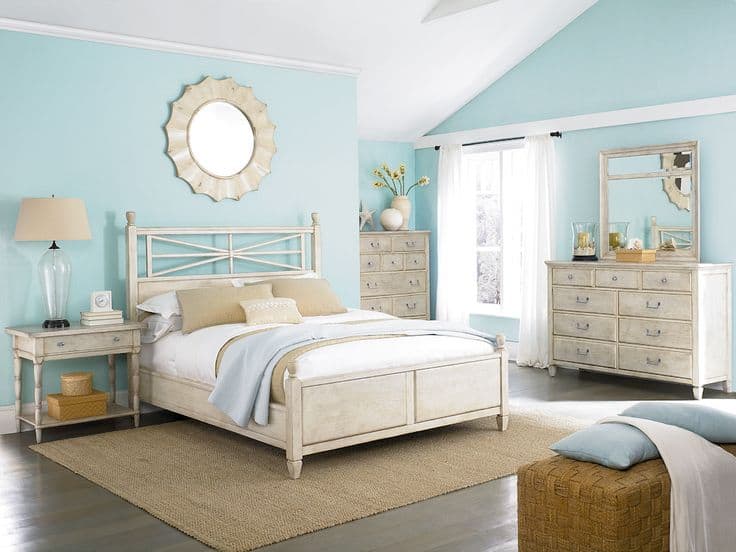 When you want a relaxing atmosphere for your room, nothing works betting than using colors with a light value. (The value of a color is based off of the shade and the tint – a dark shaded color has a dark value, and a light shaded color has a light value). Choose a color close to white, mainly tertiary colors are a good pick when trying to create a cool space like this one, because they tend to be the most pasteli (or in other words, kind of flat and soothing – they don’t pop). Also, when you’re buying the paint colors for you walls, buy the color in eggshell. That will leave it with little to no shine, so it’s all together just a little more soothing. When creating this – tan and white are always good accent colors when it comes to choosing the furniture because they blend with the light color, not contrasting against (like we talked about earlier with Primary and Secondary opposites).
8. Light
Light is also an important part to colors, and when creating a room that you want to feel light and airy – you have to consider your light sources. Choose curtains of a cream or white color, that way they don’t block out the sun and add depth to your room. Stick with low watt bulbs so they don’t glare in your face when turned on, but are absorbed by the eggshell matte on the walls and create a calming atmosphere for you to enjoy.
9. Dark
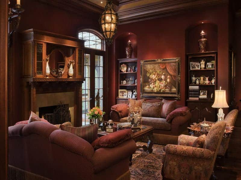
In the world of colors, dark is just as important as light – and it’s a major part of design to! If rustic is more your vibe, and you like a dark cozy space, then consider using values of dark colors – but don’t think they have to be monochromatic! Brown is a safe bet when concocting a room like the one above because it can be flattered by nearly any other dark color (except black – don’t be the guy in a black suit with brown shoes – just don’t). Use dark values of reds and greens – real earthy colors to give your room that old world log cabin feeling, and choose a dark color for the walls.
10. Brown
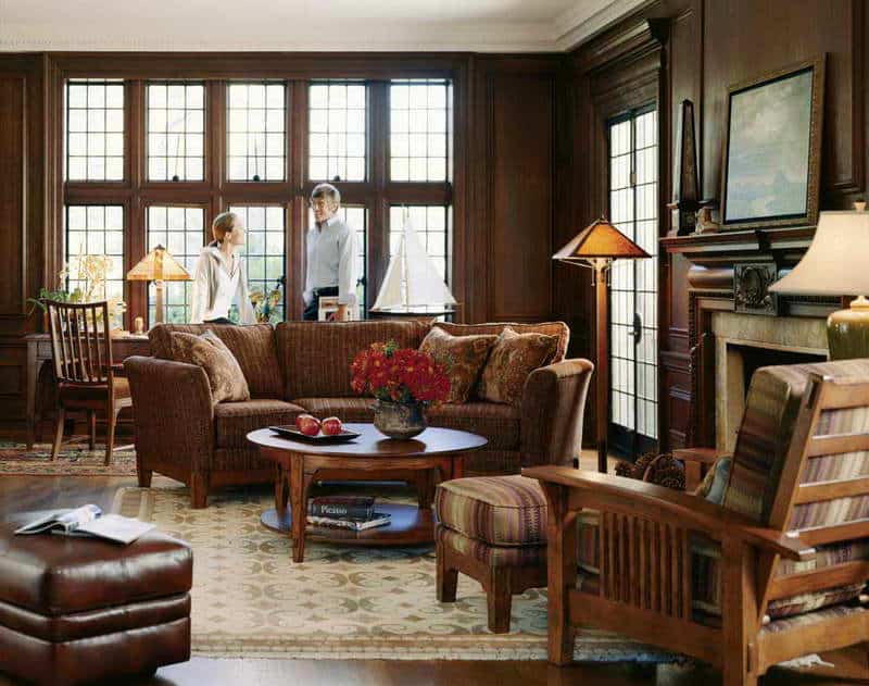
I added this section because brown can be such an important part of decorating, and it doesn’t have to be dark like this (even though we’re going to focus on this hue because tan is an accent color that is derived from brown and we’ll talk even more about that in a minute). Dark colors can make any room feel cozy and warm, but buyer beware – if you’re looking to make a small room feel bigger, dark colors are not going to help you achieve that at all. Brown, like in the picture above, will make a room feel smaller (though much more cozy) and when decorating and seeking that kind of feel, darker colors can nearly always be matched with a nice shade of brown.
11. White
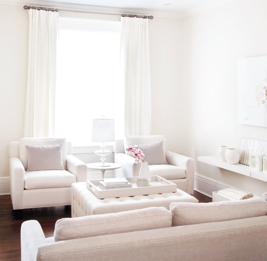
This is a fantastic shade if you are looking to make a smaller room feel bigger. Although white is the standard go-to when seeking to accomplish something like this, any light color will help you pull it off.
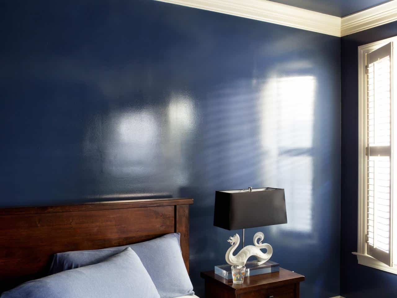
12. Matte and Glossy

When you’re looking to create a feeling for your room, many folks may not realize it, but the sheen of your paint has a major effect on the aura of your room. For example – if you want to nice, cute, beachy feeling room (like pictured way above) you probably don’t want to choose a high gloss (shiny) paint that you can use to remove that spinach from lunch that is stuck in your teeth. You’re going to want to choose a matte gloss – like eggshell (also mentioned above) which will absorb light – not reflect it. However, if you’re looking for a wild and crazy vibe, then go all out on the gloss! Semi-gloss paint will give you a meet in the middle sort of feel. It won’t feel like a mirror, but it won’t bounce too much light off of it either. High gloss paint will give your room an electric feel. Notice how above it really pulls your eyes right to the walls.
13. Trim Accents
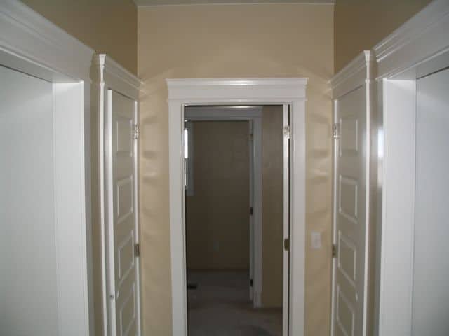
As you decide which color you want your room to finally be, consider which way you want your trim to look also. Are you seeking a more traditional, white look that will bring all your trim to life without making it jump off the walls and eat the color? Or, are you going to opt for something a little more different, maybe reverse it with light walls and dark trim? Whichever you decide, remember to use the color wheel to help you choose the right color to achieve the look, if you want to contrast your trim, or make it sort of blend and pull the room together.
14. Pattern It Up.
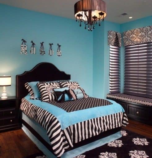
When you’re searching for that wild feeling, or even maybe something a little softer – don’t think you have to stay solid! In fact, losts of patterns and shapes can make any room complete. If you’re going for a calm feeling, search for soothing patterns, waves, squiggles, of polka dots can help you out. Or, if you’re on the wild side, splash around some zebra print or checkered board. And don’t be afraid to use your accent color in the pattern! If you have a yellow room, maybe you opt for a purple pillow with some teal! Or, if you have a calm blue room, grab a nice soothing tan and yellow polka dot.