
Every honey oak kitchen on the internet gets the same advice. Paint it all white. Open it up. Make it feel bigger. That’s the safe answer, the one Pinterest keeps serving up. But “safe” is what makes every painted oak kitchen look like every other one now.
This homeowner, working with Pezzotti Painting, ignored the playbook. She painted her uppers in Valspar Bay Waves (a soft warm white) and her lowers plus pantry wall in Valspar Mountain River (a deep moody navy), both in a 10 sheen. She kept her counters, backsplash, and floors.
The result doesn’t just look updated. It looks expensive. And a kitchen this narrow feels bigger now than when everything was oak.
Table of Contents
The kitchen she started with
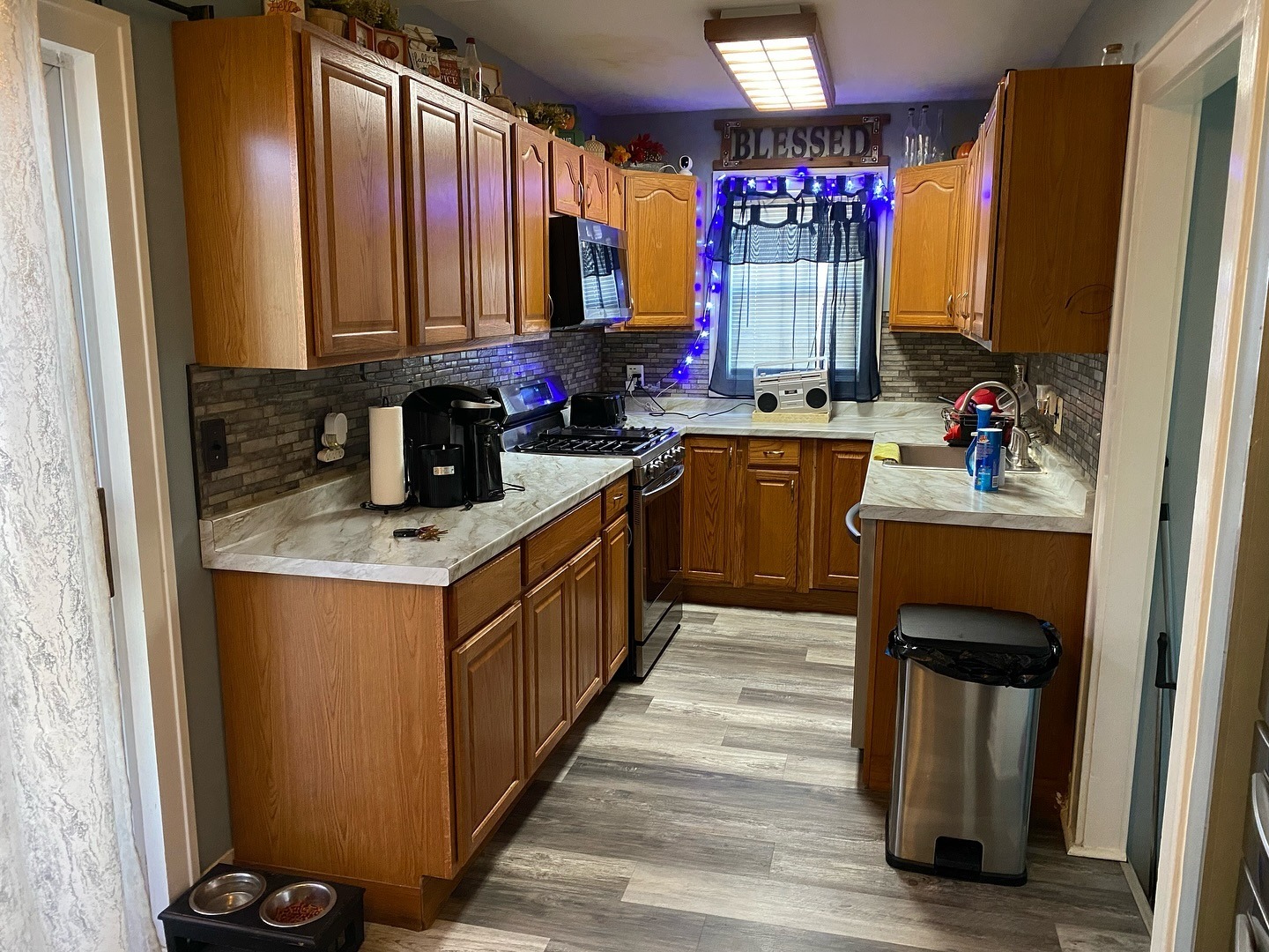
A tight U-shape. One window. Low ceiling. Oak from the base cabinets all the way up. The counters and backsplash were already updated, but the cabinets did what honey oak always does, swallowing every bit of light. The bones were fine. Nothing gave your eye a place to rest.
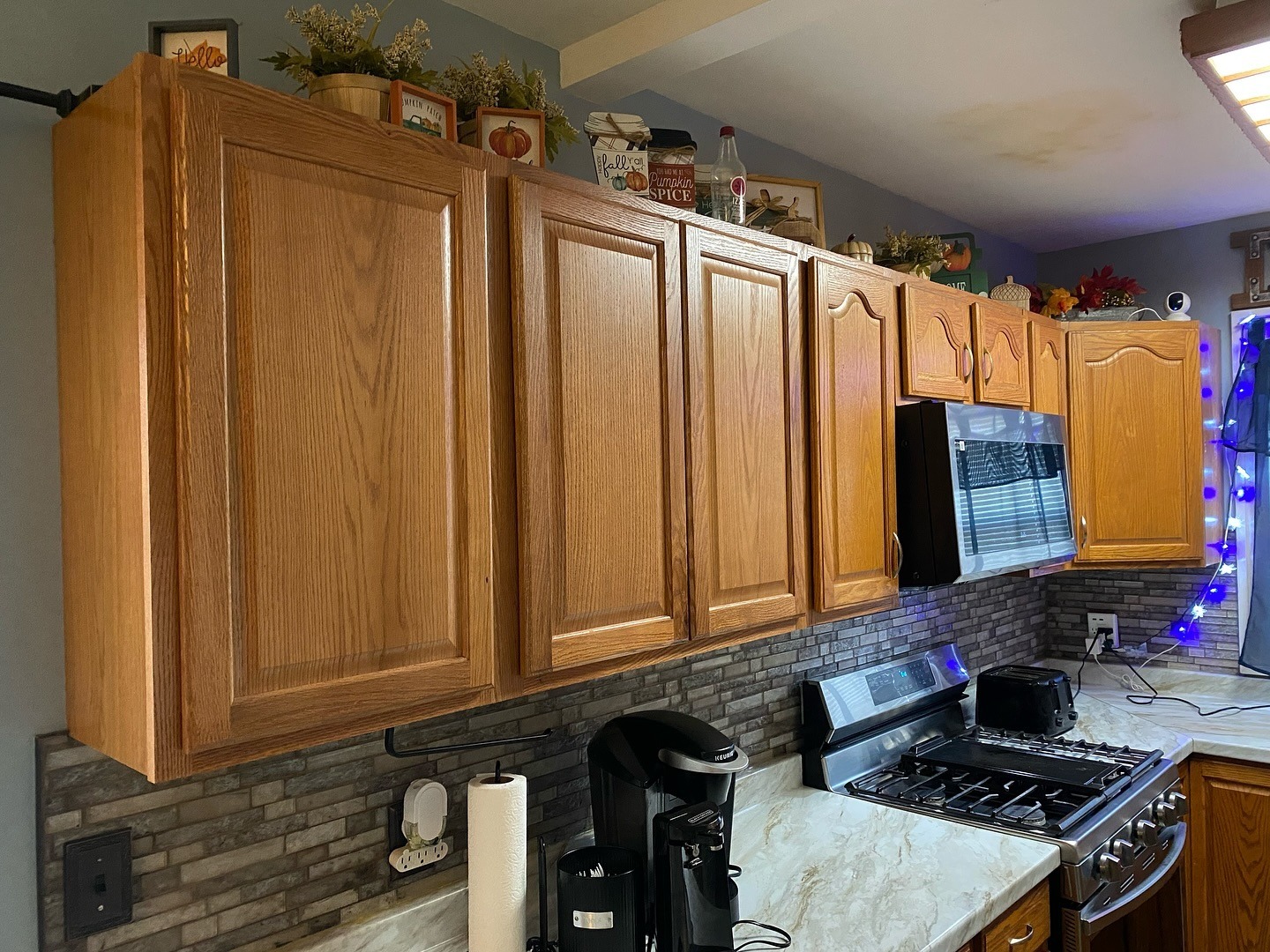
Up close over the stove, the oak was fighting itself. Arches, raised panels, and warm orange tone all competing at once.
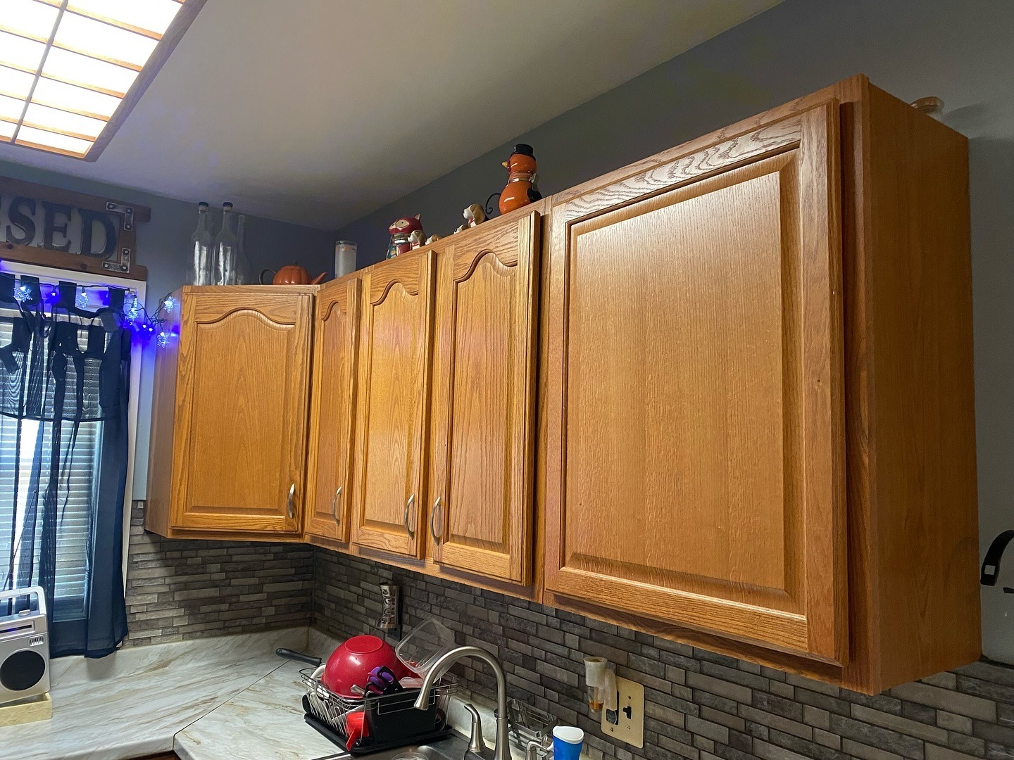
Same problem on the sink side. The arched doors doing their best, the color just not letting them breathe.
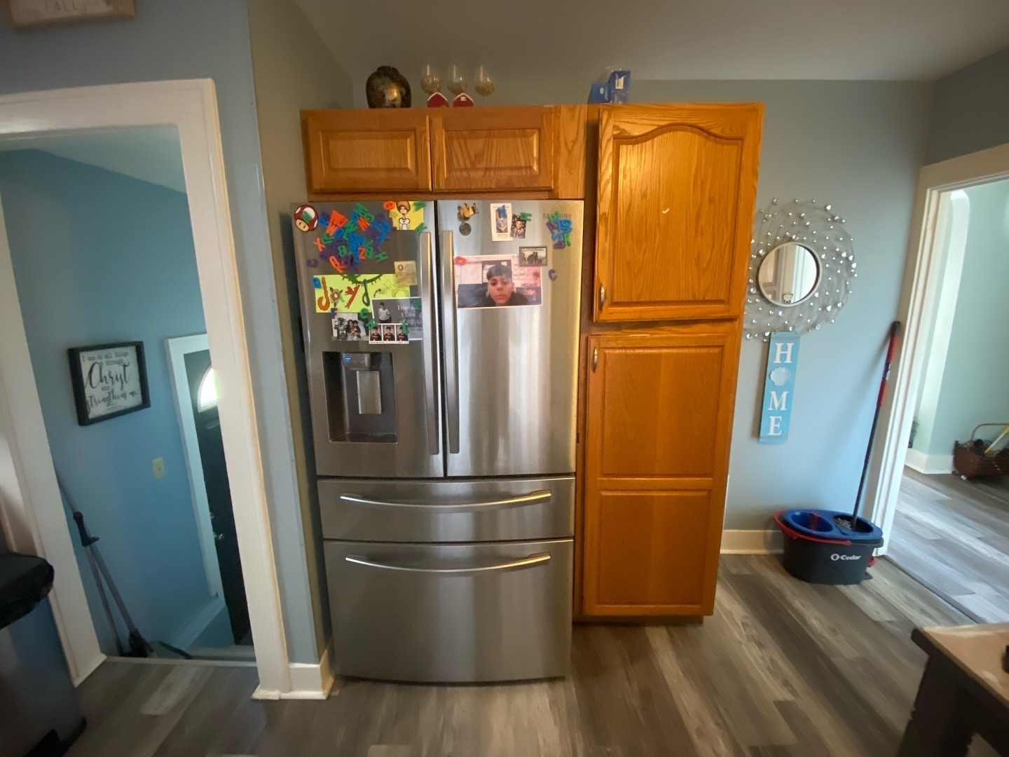
And here’s the fridge wall. A gorgeous French-door Samsung sitting next to a tall oak pantry, both of them cancelling each other out.
Why she didn’t go all white
The default move here is paint everything bright white. It works, it photographs bigger. But it has two quiet problems nobody talks about.
First, it flattens the room. Nothing grounds the floor plan, so your eye slides up a solid wall of white with nowhere to land. Second, lower cabinets live a hard life. Dog paws, dishwasher splashes, trash can rubs. White lowers look tired within a month.
She went a smarter route. Moody color low, where it grounds the room and hides the wear. Light color up high, where it bounces the window light. The oak grain still shows through the paint, so the cabinets don’t look like plastic slabs.
The after that proves the point
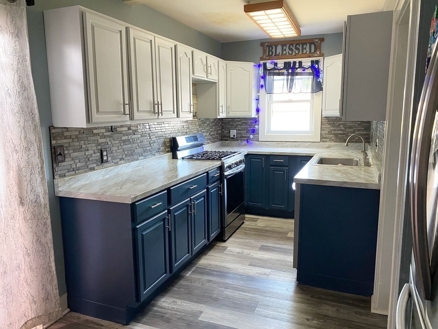
Same room, same window, same counters. Only the cabinets changed.
Your eye finally stops moving. The navy grounds the kitchen like a rug grounds a living room. The white up top lifts the ceiling by what feels like a full foot. That break at counter height tricks your brain into reading two shorter zones stacked, instead of one long oak tunnel.
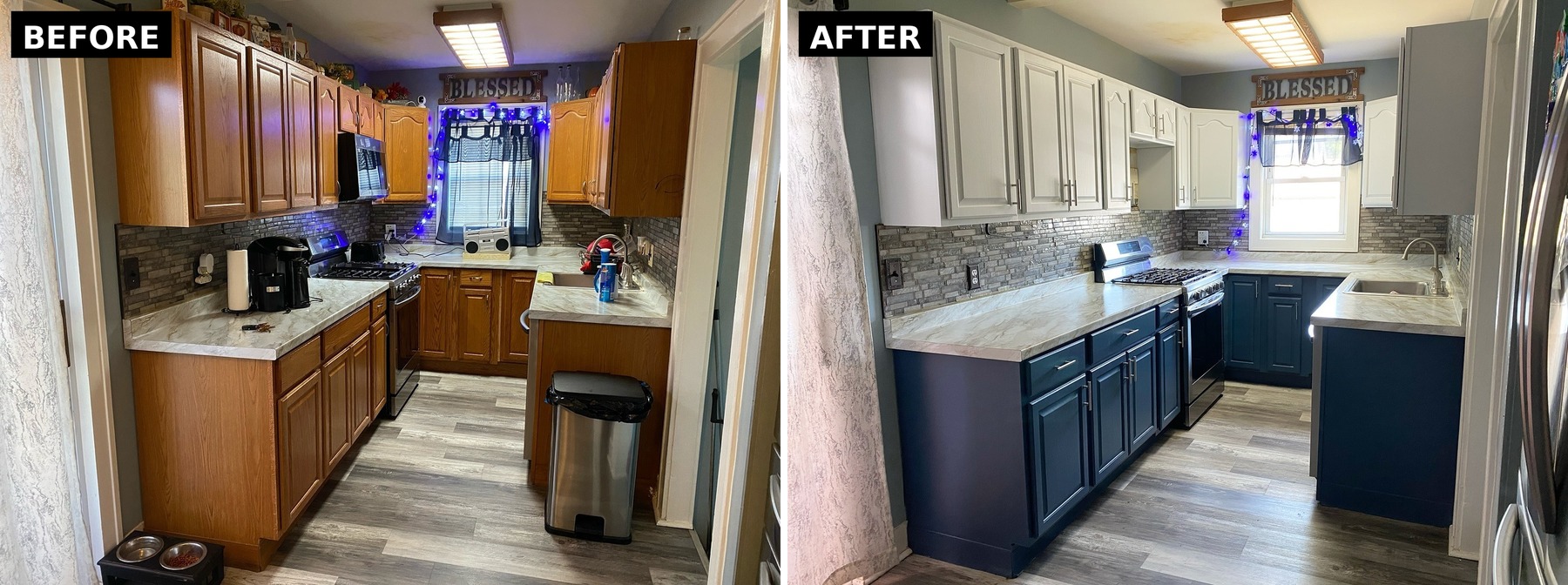
Nothing structural changed. Paint, hardware, and knowing which half gets which color.
The uppers: why Bay Waves works where plain white wouldn’t
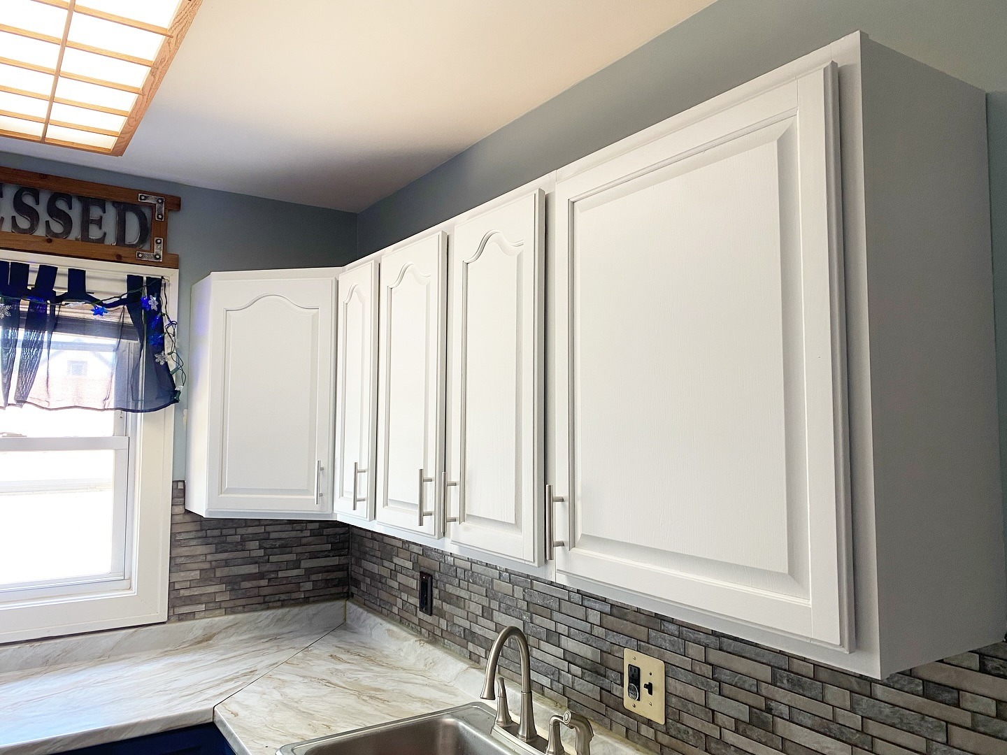
Bay Waves is the quiet hero. Warm, not stark. The arches and raised panels still read clean, which is what separates a real paint job from one that looks like someone rolled it with a wall roller. Brushed nickel bar pulls replaced the old silver knobs, and that one swap pulls the kitchen forward a decade on its own.
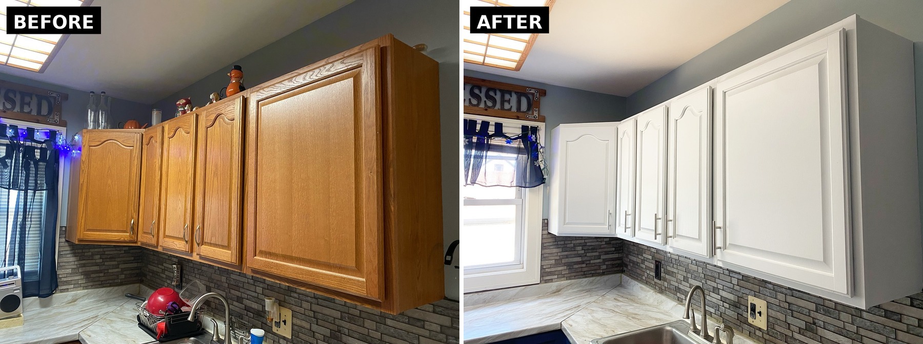
Same bodies. Same arches. Two very different kitchens.
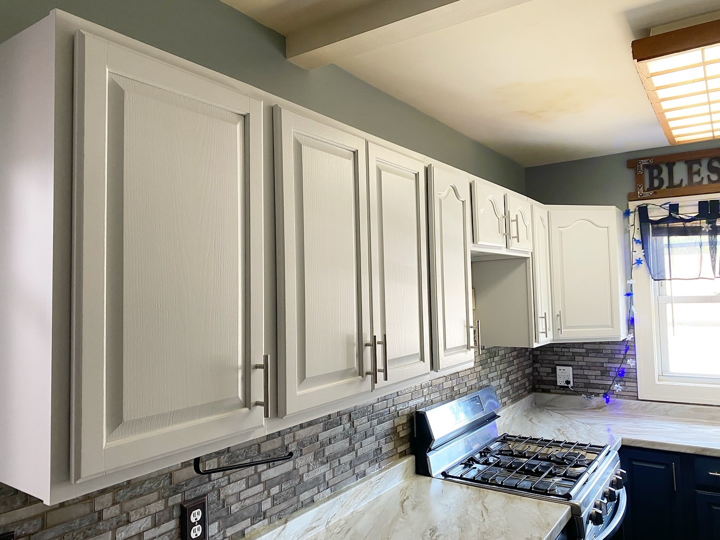
Over the stove, the old microwave came out. Without it chopping up the wall, the uppers read as one clean run.
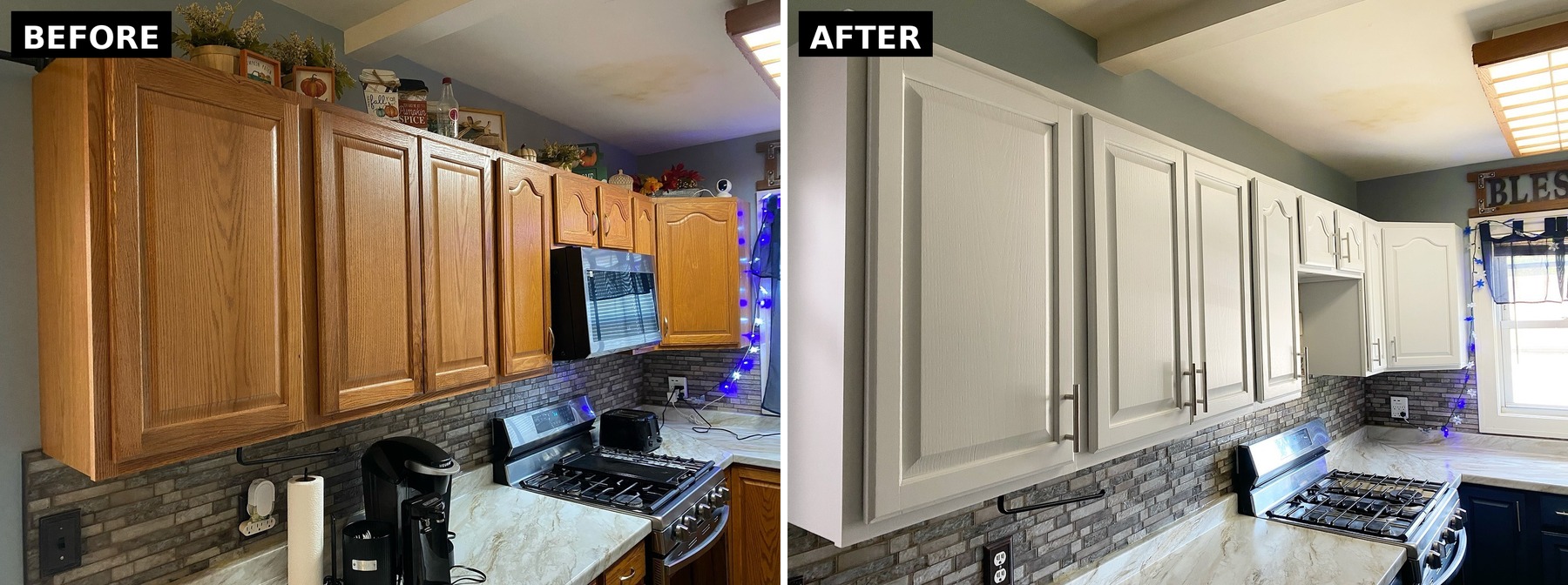
Pulling the microwave wasn’t strictly necessary, but with the paint, it took the kitchen from builder grade to custom in one shot.
The lowers: why Mountain River beats a plain navy
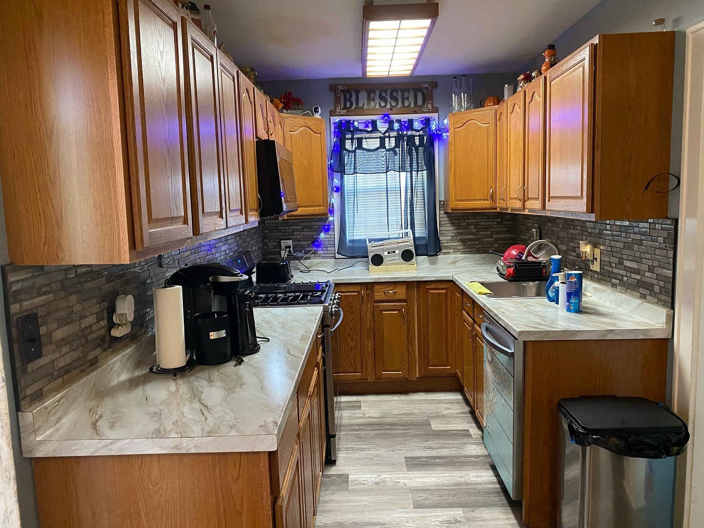
Before paint, the same angle looked like this. Oak cabinets, oak dishwasher panel, everything blending into everything. A lot of work for your eyes just to find where the room ends.
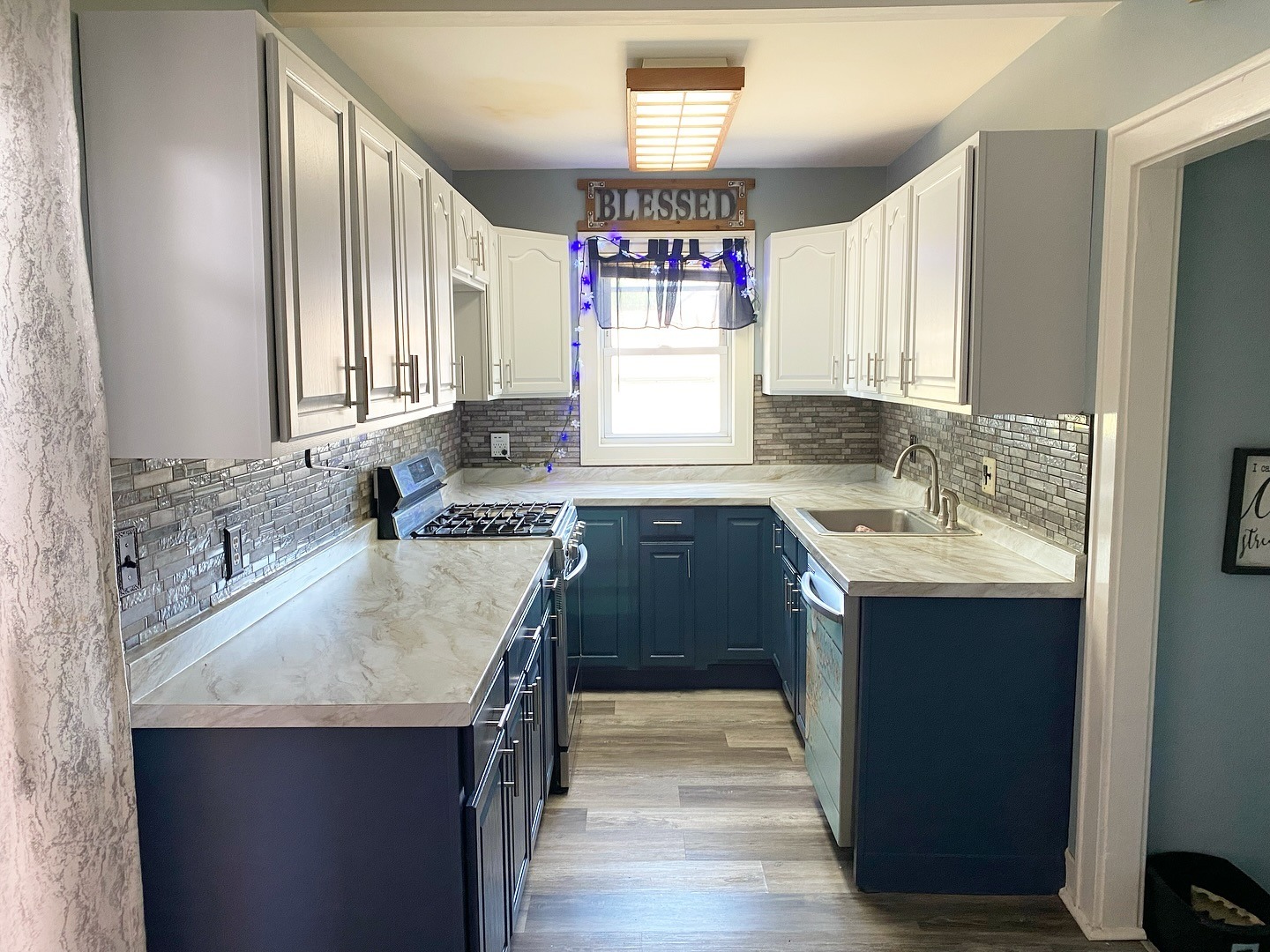
Mountain River reads almost black in shadow and clearly blue in light. That’s what keeps it from looking flat. Against the warm counters and gray backsplash, it feels custom. Tell someone this came out of a showroom and they’d believe you.
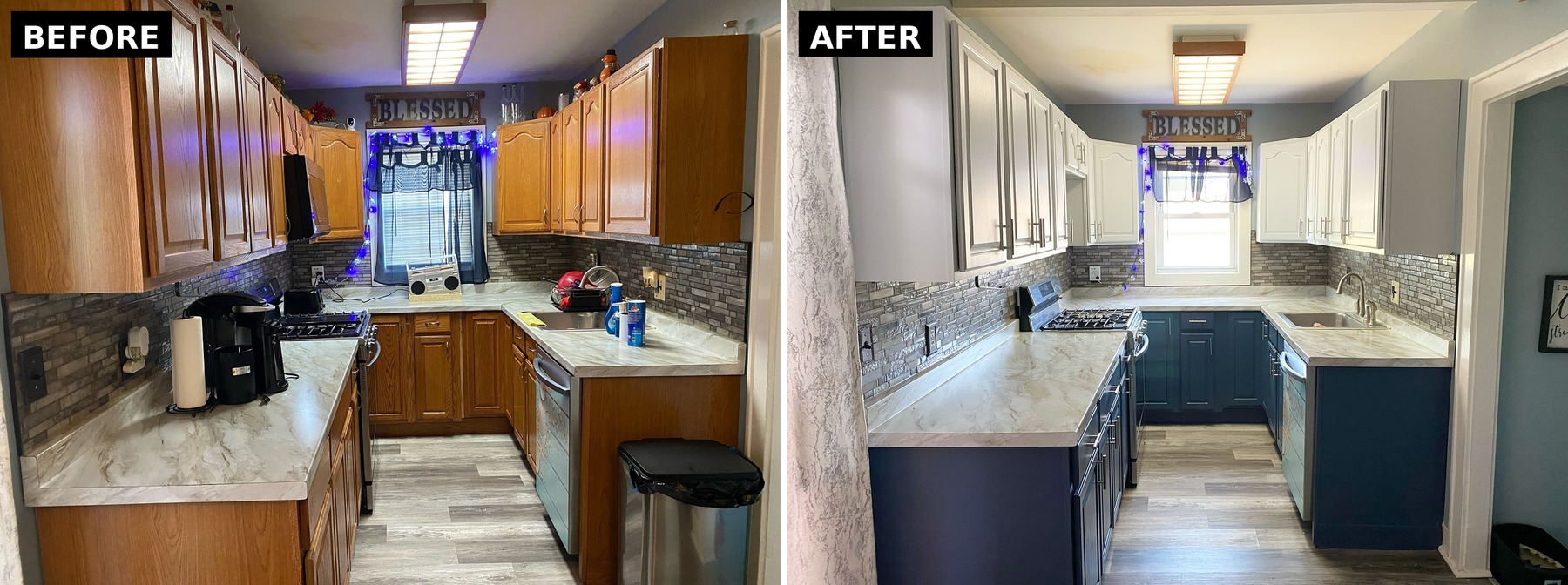
Same angle. Same sink. Same stove. The room stopped fighting itself.
The fridge wall is where it really lands
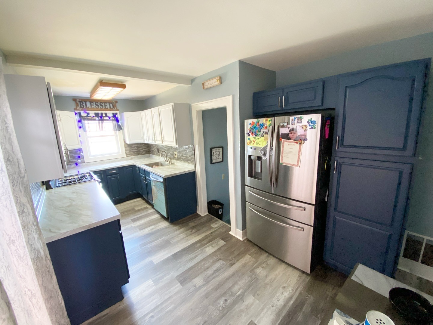
The Samsung fridge finally gets to be the star. Surrounded by deep navy instead of competing oak, the stainless pops. The pantry reads like one solid piece of furniture, almost a built-in armoire.
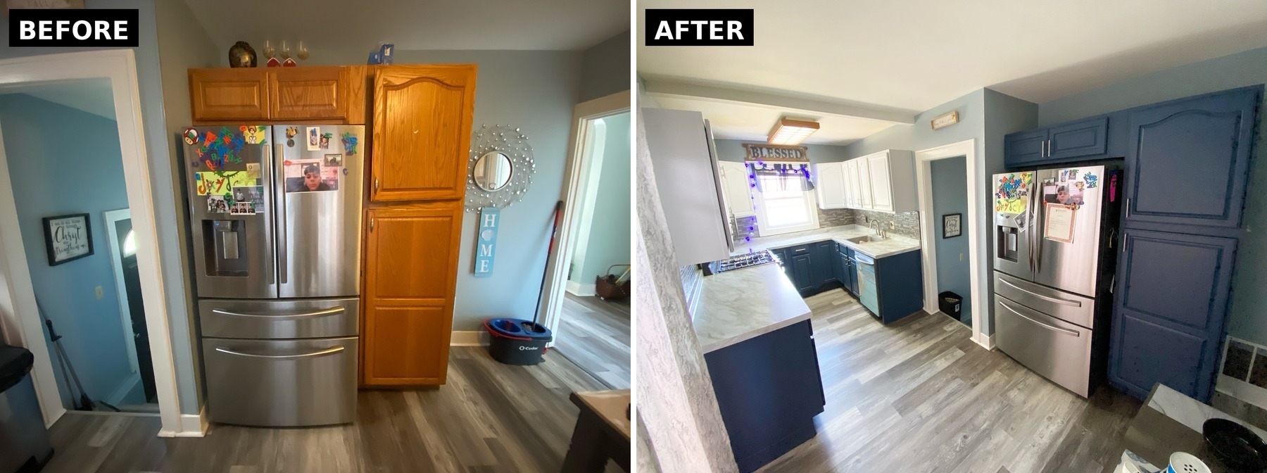
Before, the fridge was one more silver object stuck in a wall of oak. After, it sits inside a frame that makes it feel intentional.
Why this beats all-white in a small kitchen
Dark bottoms ground the eye. Your gaze stops at the counter line instead of sliding up a wall of sameness.
Light tops lift the ceiling. Warm white bounces window light up, which makes a low ceiling feel higher without touching a joist.
The break at counter height tricks the brain. It reads the room as two shorter zones stacked, not one tall box.
Navy hides what white can’t. Mountain River will still look fresh three years from now. White lowers would need touch-ups by month six.
The oak detail still shows through. A 10 sheen keeps the panels and arches visible instead of flattening them into slabs.
The takeaway
She didn’t paint her cabinets white. She put color low where it grounds, and light up high where it reflects. The kitchen she ended up with looks custom, feels bigger than the oak version did, and will hold up longer than all-white ever would.
Next time someone tells you the only way to update a honey oak kitchen is to paint it all white, send them this room.
WHAT DO YOU THINK?