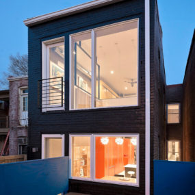
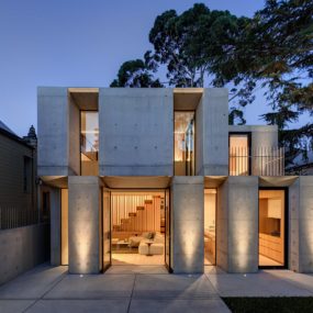
Choosing the right colors can completely transform the look and feel of your living space. These 24 living room color scheme ideas are vibrant, versatile, and beautifully balanced — perfect for setting the mood, enhancing your style, and making your living room feel cohesive and inviting.

24 Living Room Color Scheme Ideas That Instantly Refresh Your Space in 2026
Color is having a major moment in 2026, and the living room is the perfect canvas to play with fresh palettes. From moody hues that create cozy vibes to bold contrasts that make a statement, the right color scheme can completely transform the energy of your space — no renovation required.
Whether you’re drawn to earthy tones, soft pastels, or dramatic jewel shades, these 24 color scheme ideas blend trend-savvy style with timeless appeal. Get ready to find your perfect palette and give your living room the glow-up it deserves.
1. Soft Blush with Warm Neutrals
This space leans into blush in the most grown-up way—soft, dusty, and layered with warm creams and gentle terracotta tones. It feels romantic without being sugary, grounded by classic details and subtle contrast.
The color scheme does all the emotional work here. It wraps the room in warmth, making everything feel calm, inviting, and slightly nostalgic.
It’s proof that pink isn’t a statement color when it’s done right—it’s a mood.
2. Classic Green & Crisp White
Deep green walls paired with clean white upholstery create a look that’s timeless and quietly confident. The contrast feels sharp but comforting, like a well-tailored blazer in room form.
Layered patterns and traditional accents soften the palette, keeping it from feeling too formal.
This is a color scheme that never dates—and honestly, never gets boring.
3. Art-Led Warm Neutrals
Here, the color story starts with the art. Warm creams and soft beiges step back just enough to let bold artwork and rich accent tones shine.
The palette feels curated rather than matched, which gives the room personality without chaos.
It’s a great reminder that sometimes the best color scheme is the one that lets your favorite pieces lead.
4. Moody Charcoal with Amber Accents
Dark, smoky walls set a dramatic backdrop, while warm amber and rust tones bring in just enough glow to balance things out. It’s moody, yes—but also incredibly livable.
The lighting plays a huge role here, bouncing warmth off darker surfaces and keeping the space from feeling heavy.
Perfect for anyone who loves depth, contrast, and a little drama after sunset.
5. Earthy Neutrals with Sculptural Warmth
This living room leans into earthy browns, soft creams, and sun-warmed clay tones. Everything feels grounded, tactile, and intentionally calm.
The palette works beautifully with sculptural furniture and bold art, giving the space a gallery-like confidence.
It’s warm, modern, and quietly powerful—no loud colors required.
6. Cozy Modern Contrast
Warm neutrals meet subtle contrast here, creating a living room that feels both fresh and familiar. Soft walls and plush seating are balanced with darker accents and playful texture.
Nothing feels overdesigned, yet every piece feels considered.
This is the kind of color scheme that makes a space feel instantly livable.
7. Green, Red & Bold Balance
This palette isn’t shy—and that’s exactly the point. Rich green seating paired with deep red accents creates a bold, confident contrast that still feels classic.
Neutral walls and clean lines keep the color story grounded, letting the furniture shine without overwhelming the space.
It’s fearless, fun, and surprisingly timeless.
8. Sunlit Neutrals with Natural Texture
Soft whites, sandy beiges, and natural wood tones come together in a palette that feels light, airy, and endlessly calm. The abundance of natural light does the rest.
Texture plays a starring role, adding depth without needing color contrast.
This is neutral done right—warm, relaxed, and never flat.
9. Creamy Layers with Subtle Contrast
This room is all about layers of cream, off-white, and soft gray, gently broken up by black accents and natural greenery. It feels clean but never cold.
The palette allows the space to breathe, making it ideal for everyday living.
Sometimes less color really does mean more comfort.
10. Soft Greige Simplicity
Muted greige walls set the foundation for this calm, cohesive living room. Paired with light wood, soft textiles, and minimal contrast, the palette feels effortlessly balanced.
Nothing competes for attention, and that’s exactly why it works so well.
It’s understated, practical, and quietly beautiful—the kind of space that always feels just right.
11. Calm Classics with a Soft Edge
This living room is all about quiet confidence. Soft greige walls, tailored seating, and a balanced layout make the space feel instantly settled—like it’s always been this way. Nothing feels rushed or overly styled.
The palette leans neutral, but it’s far from flat. Subtle contrast in textures and finishes adds depth without disrupting the calm.
It’s the kind of room that doesn’t chase trends—it just ages gracefully.
12. Green Meets Yellow, Done Boldly
This space knows how to have fun with color and still feel grounded. That punchy yellow fireplace instantly steals the show, while the green sofa brings everything back down to earth.
What makes it work is the balance—bold color moments paired with classic shapes and lived-in styling. It feels playful, but not chaotic.
A great reminder that color confidence doesn’t mean sacrificing comfort.
13. Modern Neutral with Sculptural Energy
Clean lines, soft neutrals, and sculptural furniture set the tone here. The palette stays restrained, letting form and proportion do most of the talking.
Everything feels intentional—from the curved seating to the minimal accessories. It’s calm, but visually interesting.
This is modern living done in a way that still feels warm and human.
14. Greige with a Moody Twist
Greige gets a serious upgrade in this space. Paired with deeper tones and rich textures, it feels moody, sophisticated, and far from safe.
The lighting and layered materials do a lot of heavy lifting, giving the room depth without overpowering it.
It’s understated drama—the kind that grows on you the longer you look.
15. Soft, Lived-In Neutrals
This living room feels like a deep exhale. Light walls, cozy seating, and a relaxed layout make the space feel effortlessly livable.
Nothing is trying too hard here, and that’s exactly the charm. It’s practical, comfortable, and thoughtfully simple.
The kind of room that always feels ready for real life.
16. Easy Balance, Everyday Style
Here, simplicity meets smart styling. Neutral tones create a flexible base, while subtle accents keep the space from feeling predictable.
The furniture arrangement feels approachable—designed for conversation, not just looks.
It’s proof that simple doesn’t mean boring when the basics are done right.
17. Soft Green Serenity
Muted green walls instantly set a calming mood, wrapping the room in a sense of ease. Paired with light upholstery, the space feels fresh and grounded at the same time.
The palette is cohesive without being monotone, thanks to layered textures and gentle contrast.
This is calm design that still feels considered—not sleepy.
18. Warm Neutrals with a Collected Feel
This living room feels curated, but not precious. Warm neutrals, thoughtful art placement, and personal touches give it real personality.
There’s a nice balance between polish and comfort—it looks styled, but you’d absolutely put your feet up here.
A great example of how layering makes a neutral space feel complete.
19. Plush Comfort, Modern Lines
Deep seating and rich upholstery make this room feel instantly inviting. The color palette stays classic, but the silhouettes keep things current.
Everything is designed around comfort, without slipping into bulky or heavy.
It’s modern lounging done properly—stylish, yes, but clearly made for relaxing.
20. Bold Contrast, Timeless Layout
This space plays confidently with contrast—dark seating against lighter walls, structured furniture softened by texture. It feels polished, but never stiff.
The symmetry and clean lines give the room a timeless foundation, while the details add character.
It’s a living room that feels both intentional and easy to live with—the sweet spot, really.
21. Refined Neutrals with Modern Polish
This living room keeps things clean, structured, and quietly confident. Soft neutrals lay the foundation, while tailored furniture and subtle contrast bring a sense of intention to the space. Nothing feels accidental here.
The palette is calm, but not sleepy—light walls, balanced tones, and crisp details work together to create an effortlessly pulled-together look.
It’s the kind of room that feels timeless now and still will years down the line.
22. Warm Leather & Natural Layers
This space leans into warmth in the best possible way. Rich leather seating anchors the room, while creamy upholstery and natural wood tones soften the overall palette.
There’s a beautiful balance between rugged and refined—nothing too precious, nothing too casual. It feels grounded and welcoming.
A perfect example of how texture can do just as much as color.
23. Dark Drama with Cozy Contrast
Deep, moody walls set the stage here, creating a cocoon-like atmosphere that feels intimate and intentional. Soft furnishings and warm accents keep the space from tipping too far into heavy.
The contrast is what really shines—dark backdrops paired with lighter textiles make everything feel richer.
It’s bold, cozy, and unapologetically atmospheric.
24. Colorful Classics with a Fresh Twist
This living room isn’t afraid of color—and it wears it well. Blues, greens, and cheerful accents come together in a palette that feels layered, lively, and full of personality.
Classic silhouettes keep the look grounded, while the color scheme adds energy and charm.
It’s joyful without being overwhelming—a reminder that color can be playful and timeless at the same time.